
Usually, every user has already experienced a 404 page, but in the optimal case, this is not common, yet a few companies make a creative 404 page smile. A well-designed 404 page can be an effective tool for getting the brand.
A 404 page has to tell users that the page that they are looking for cannot be found. This is the most important thing, and many websites tend to place a search bar or button on the error page to get them to interact further.
There may be several cases, one of which is that the page has already been deleted but the user can still click on it while searching on Google, and another is that the user accidentally types in the URL of the website. Or a common case is when the redirect isn’t right, the content already exists on another page.
As inspiration, we’ve collected a couple of great ideas from around the world.
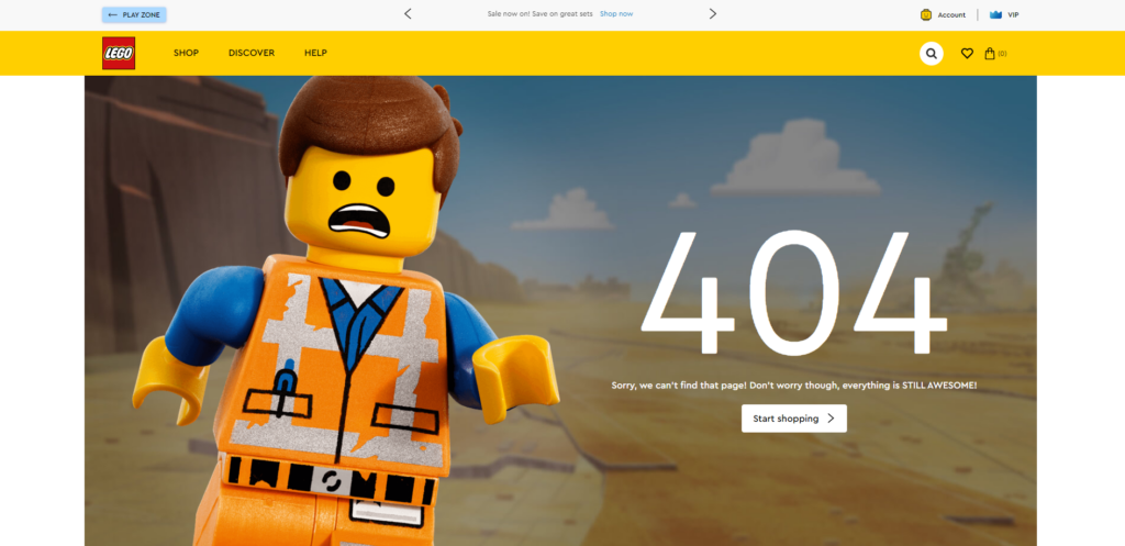
The 404 page on Lego’s official site is simple, yet it’s clear what kind of company it is, as a huge Lego figure watches the user. The site is eye-catching!
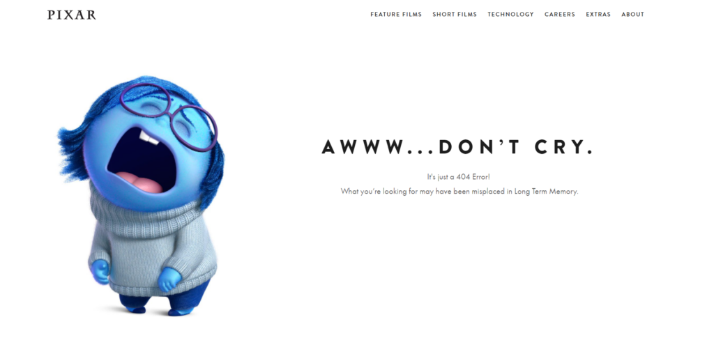
One of our personal favourites is the 404 page of Pixar, where the character of the Inside Out Sadness is sad and trying to calm the viewer. They couldn’t have chosen a better character, but we are missing a search bar.
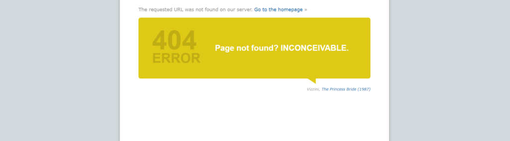
IMDB is the most popular cinema, film, TV series portal, and thus our 404 page is relevant, as each time a quote from a movie/series states that the page is not found, and next to it they indicate who said which work.
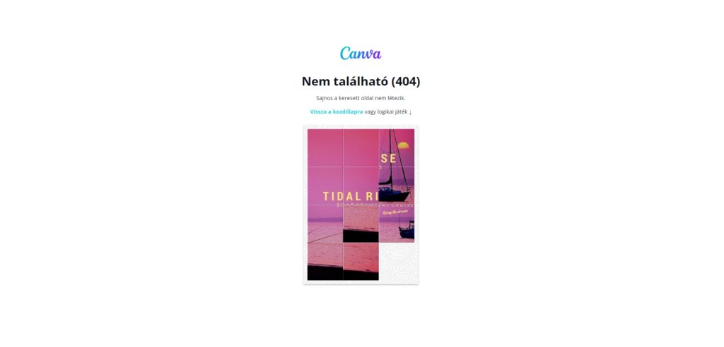
Users can also smile on page 404 of the online graphics editing page, as they also offer a simple logic game in addition to returning to the main page.
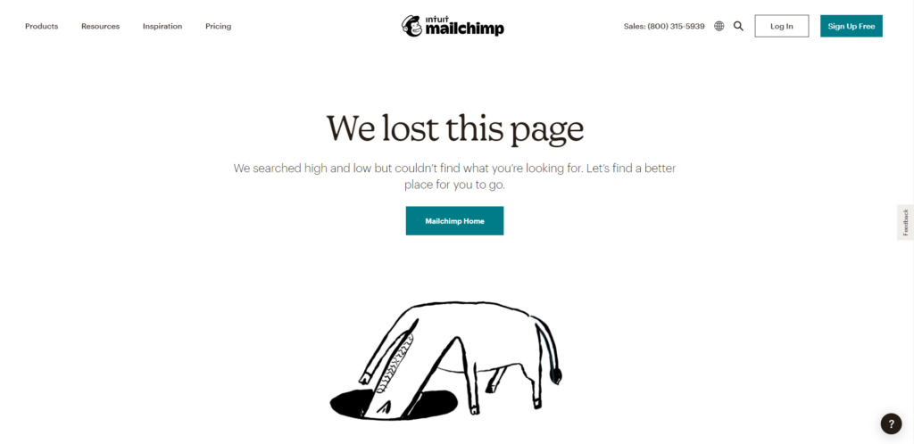
Mailchimp awaits the users with a little animation on its error page as it searches for what it wants to find. There is also a button to return to the main page with one click.
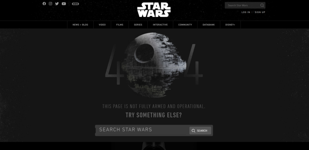
404 page of the official Star Wars site, as we imagined it, of course, the Death Star under construction awaits us on the site. Based on this, the brand can be determined immediately, and there is also a search box below it..
Main photo: Erik Mclean / Unsplash
