Widgets
- Comments
- Countdown
- Grid gallery
- Image
- Call To Action
- Service Box
- Modal
- Embed
- Pricing table
- Tabs
- Accordion
- Splash Screen
- Download Button
- Space
- Video Lightbox
- Google Maps
- Social buttons
- Contact Form
- Chart
- List
- Primary Menu
- Audio
- Icon
Comments
This Guide will Help you to Add Comment Widget to your pages/blog post.
Note: Currently, Disqus is supported by SitePad. We will add more to Comments option soon.
Note: You can add Disqus comments on your blog post as well as a page. You just need to drag the Comments widget on all the pages where you want to add the comments option.
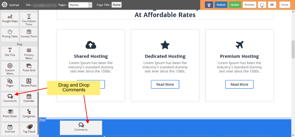
DRAG COMMENTS WIDGET
When inside the SitePad Editor Drag and Drop the Comments widget. As shown in the Image Below.
Once you have dragged and drop the Comments Widget you will need to Add Disqus short-name. ex: shortname.disqus.com or just the short-name. In-case if you do not have a Disqus account you can create one here.
Note: You will need to configure Disqus following the steps on their create site page, before using the short-name in SitePad.
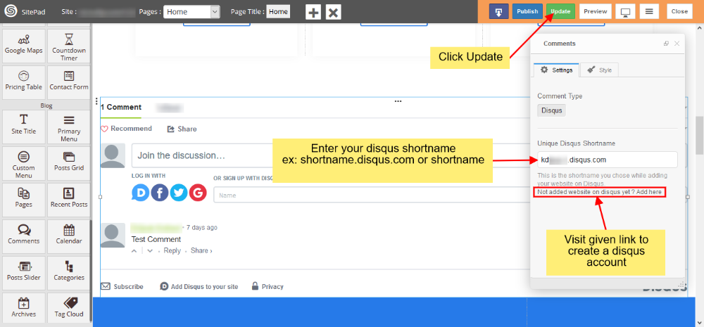
Once you have added your Disqus short-name on your page in SitePad editor click on Update button to save the changes.
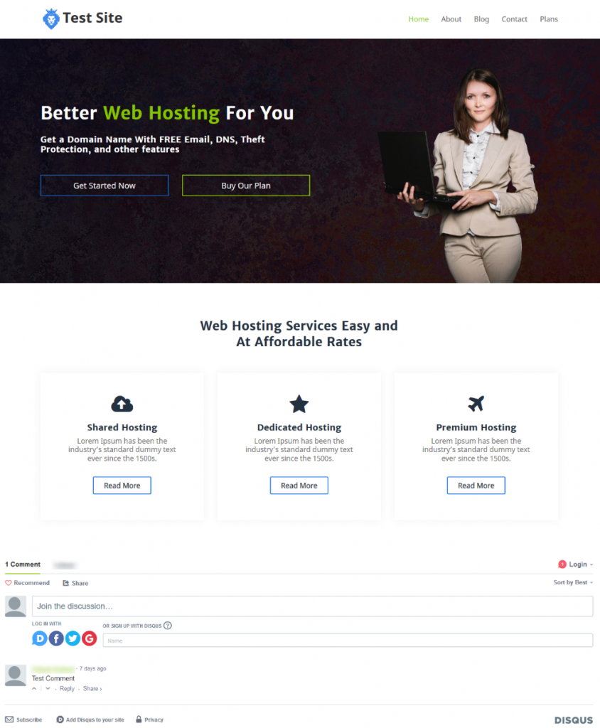
PREVIEW AFTER PUBLISH
You can check the comments on your site after Publishing your site.
Countdown
This Guide will Help you to customize Countdown Timer Widget Settings and Style.
Note: Widget gives you Default Style provided by theme, you can customize as per your needs using this guide.
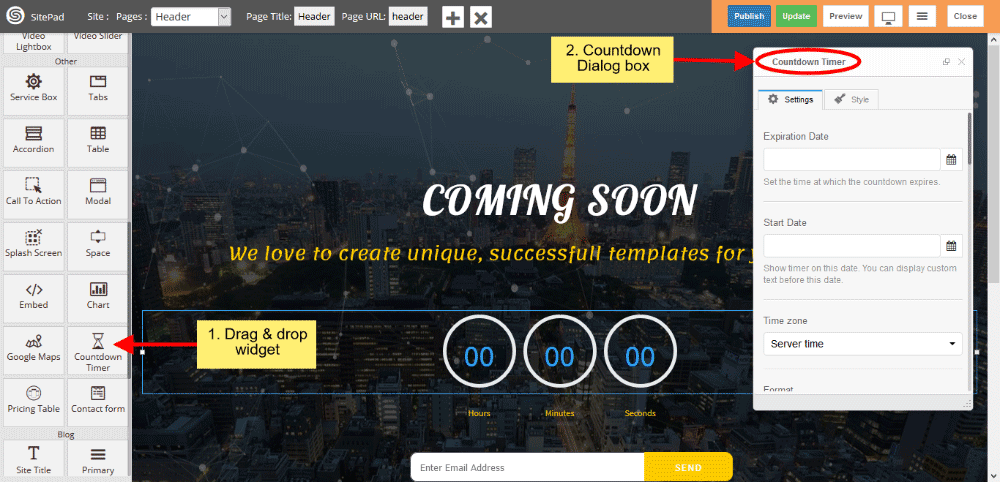
DRAG & DROP COUNTDOWN TIMER WIDGET
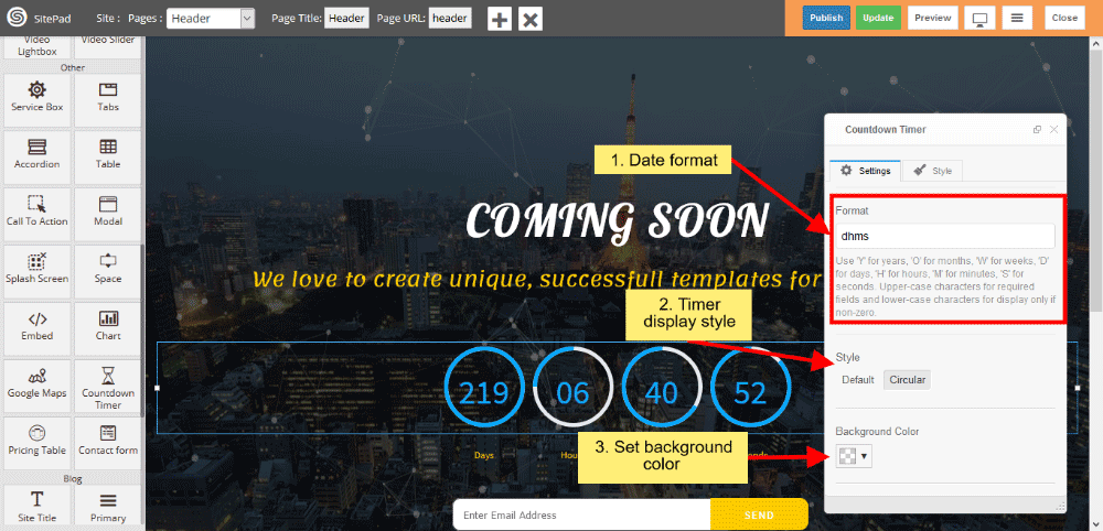
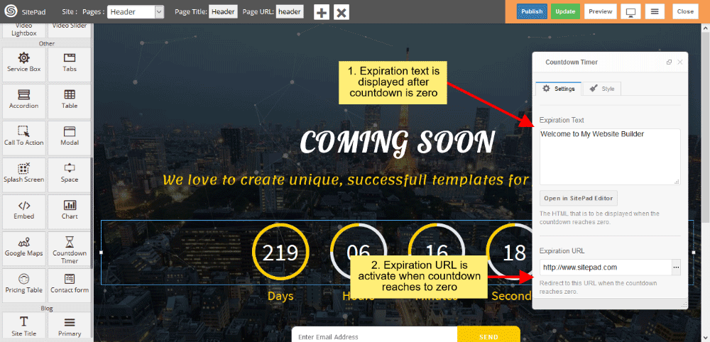
When you Drag and Drop Countdown Timer Widget in a Page, You will see the image shown like below.
COUNTDOWN TIMER SETTINGS
- Set Expiration Date by clicking on Icon Calendar as per your needs, set the time at which the countdown expires and Set Start Date by clicking on Icon Calendar also.
- Select the time zone from select option either user’s Local machine or Server time.

- Write the Date format for displaying the Timer.
- Style gives Timer Style such as Default and Circular, by default Circular is enabled.
- Set the background color for timer blocks.
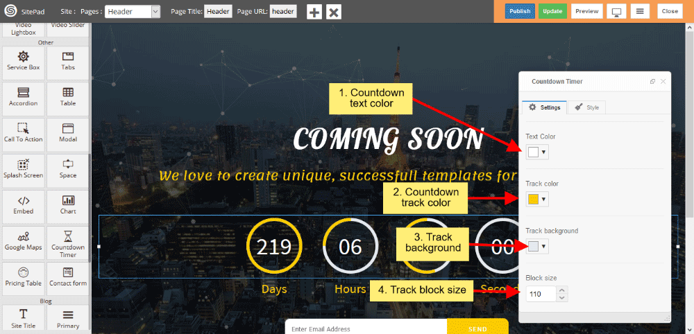
- Give the color of the Text, Track and Track Background.
- Set the Track block size.
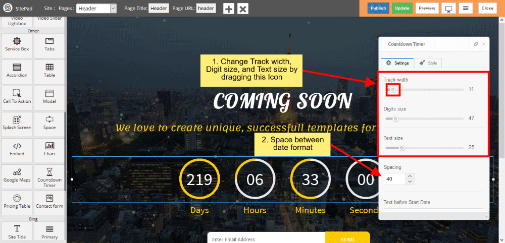
- Change the Track width, Digit size and Text size by dragging Icon horizontally.
- Spacing gives space between the Block.
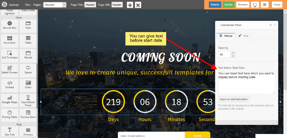
- You can give Text before starting the date.
- Expiration Text is displayed when the countdown reaches to zero.
- Expiration Link is activate when the countdown reaches to zero.
Grid gallery
This Guide will help you to add Grid Gallery.
DRAG AND DROP
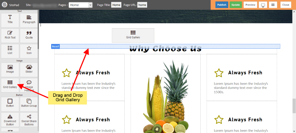
- Drag and Drop Grid Gallery from left side Widget Panel as shown in image below.
SELECT IMAGES
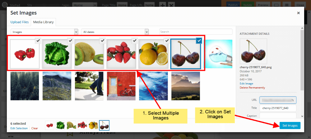
- Select images from Media Library as shown in below image.
- You can upload images by Clicking on Upload Files.
GRID GALLERY SETTINGS
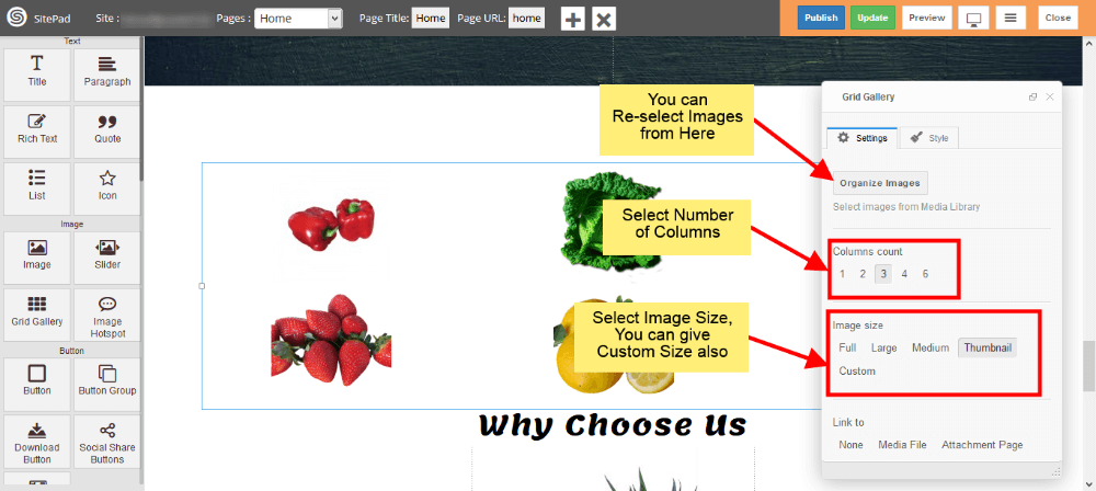
- If you want to Change, Delete or Add images you can do that from Organize Images.
- Now select Column count for Images.
- Select Image size from options or Select Custom option to add custom size for Images.
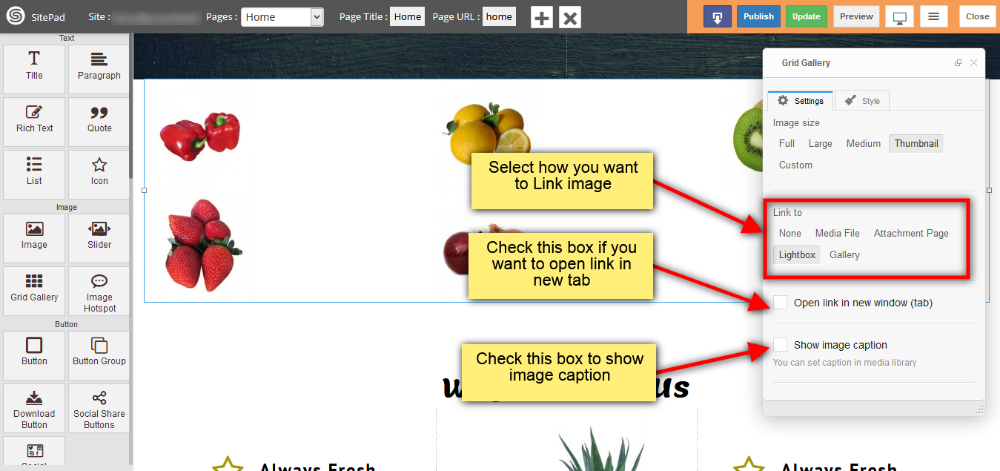
- Now select Link for your Images.
- If you want open that Link in New Tab then check Open link in new window(tab).
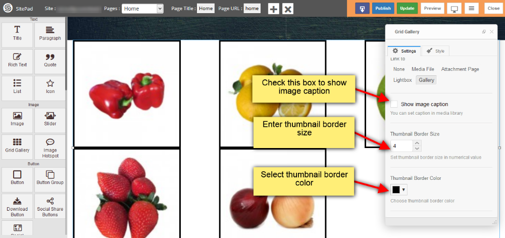
- To show image caption below image just check Show image caption.
GALLERY OPTION IN GRID GALLERY
This option is available in link to section. By selecting this option your images will pop up when you click on it. You can add following properties for Gallery image.
- You can add image thumbnail Border Size and Color as shown in image below.
- Also you can add spacing around image thumbnail, set pop up gallery image Border size and color as shown in image below.
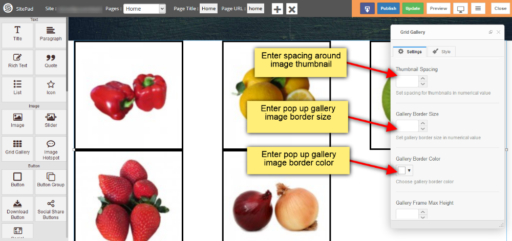
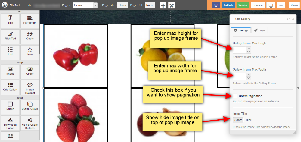
- You can set max height and max width for your pop up image frame
- Check Show Pagination box if you want to show pagination
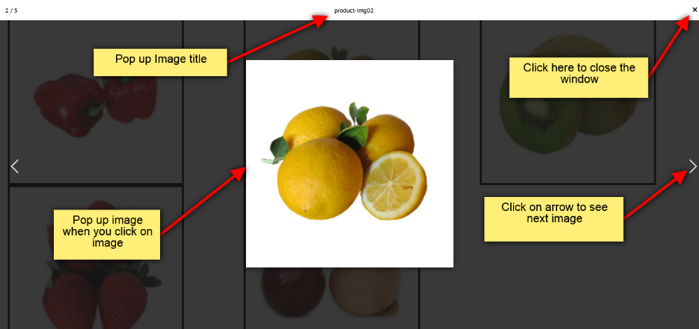
- Provide the visibility for image title as shown in image below.
- When you click on gallery image on your webpage the pop up will appear as shown in image below.
- When you click on gallery image on your webpage the pop up will appear as shown in image below.
Image
This Guide will help you to add Image.
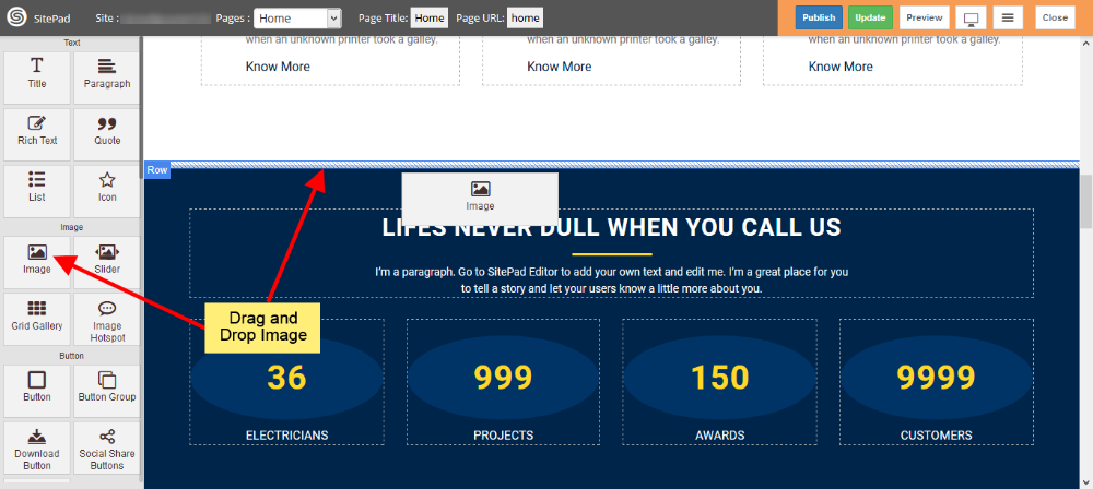
DRAG AND DROP IMAGE
- Drag and Drop Image from left side Widget panel as shown in image below.
INSERT MEDIA
- When you Drag and Drop Image it will open Insert Media window as shown in image below.
- Here you can select image from Media Library or you can upload Image by clicking on Upload Files.
- You can also give URL of Image by clicking on Insert From URL as shown in image below.
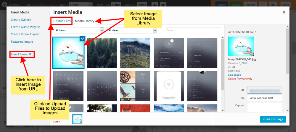
IMAGE SIZE
- Once you have selected image you can see Dialog Box for Image.
- Here you can Select or Replace Image if you want as shown in image below.
- Select Image size from different options, you can also give Custom size, for that you need to select Custom option and then enter Width and Height(eg. 100×100).
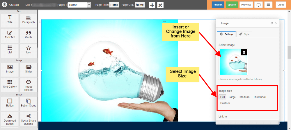
IMAGE LINK
- Now select how you want to link your image by using Custom URL , Media File or Lightbox.
- Give link if you select Custom URL or Media File in Link to section. If Don’t want to attach image with link then leave it as blank.
- If you want to open link in New Tab then Check the box shown in image below.
- If you want to Show Image Caption then check Show Image Caption box.
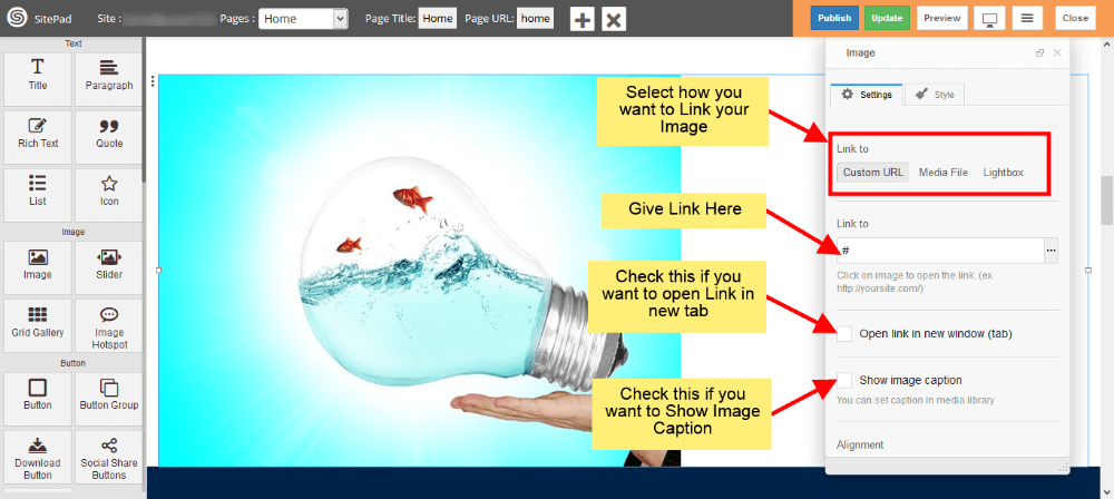
IMAGE ALIGNMENT
- Select Alignment for image as shown in image below.
- If you want overlay over image then check the Overlay Hover Effect box. This effect will show up when Hover on image in website.
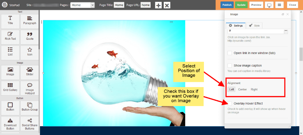
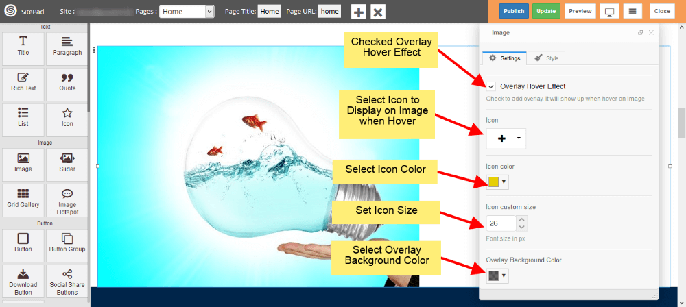
IMAGE OVERLAY
- If you want to add overlay over image then first check Overlay Hover Effect Box as shown in image below.
- Now select Icon to display over image.
- Select Color and Size for that Icon.
- And in the end select Background color for Overlay as shown in image below.
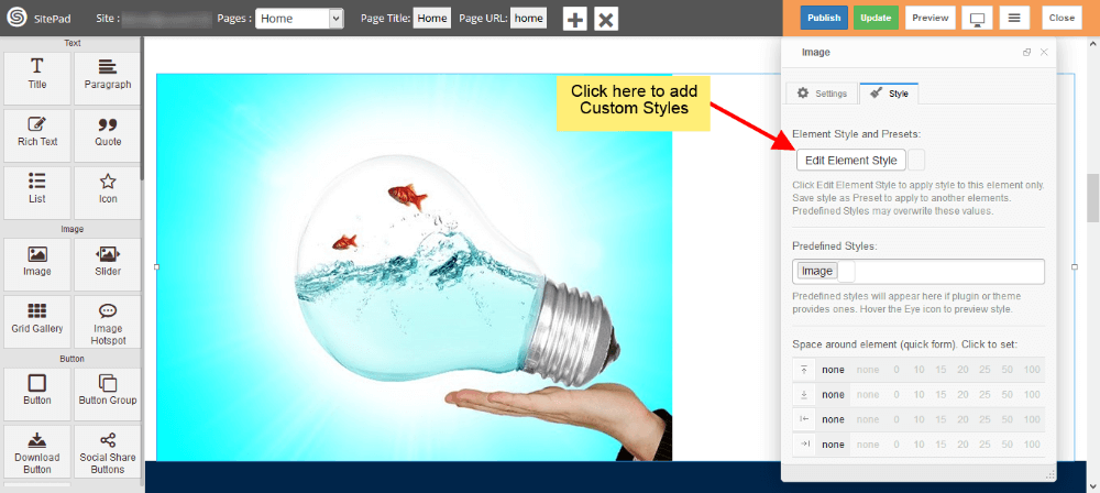
CUSTOM STYLE
- You can add your Custom style by clicking on Edit Element Style as shown in image below.
Call To Action
This Guide will Help you to edit Call to Action Widget Settings and Style.
DRAG & DROP CALL TO ACTION WIDGET
When you Drag and Drop Call to Action Widget in a Page, You will see the image shown like below.
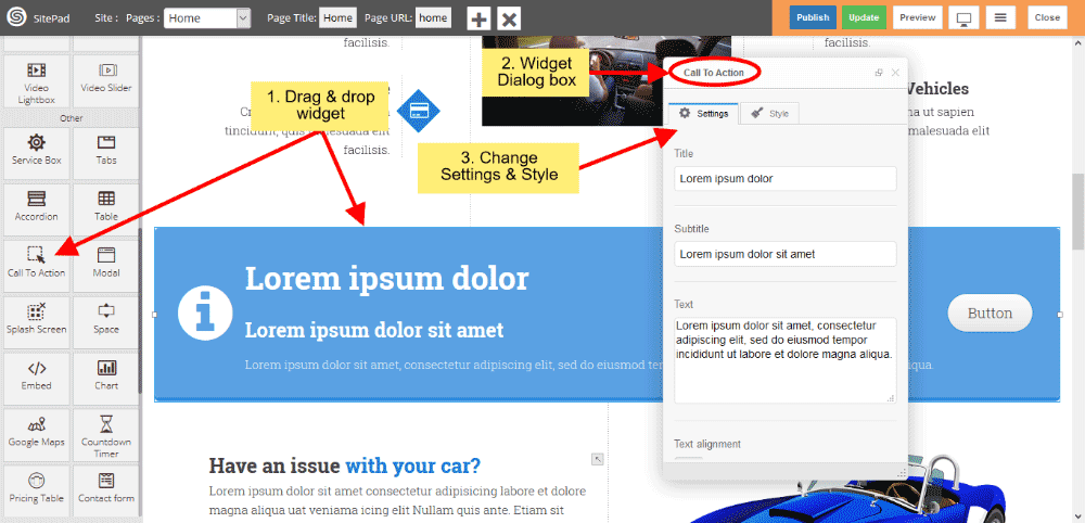
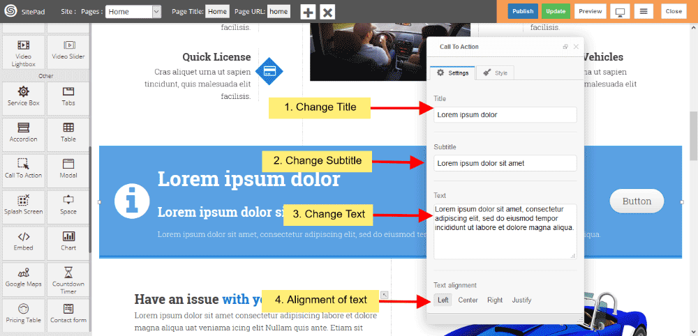
CALL TO ACTION TEXT
- You can change or customize your Title, Subtitle and Text.
- Text alignment gives you alignment of text.
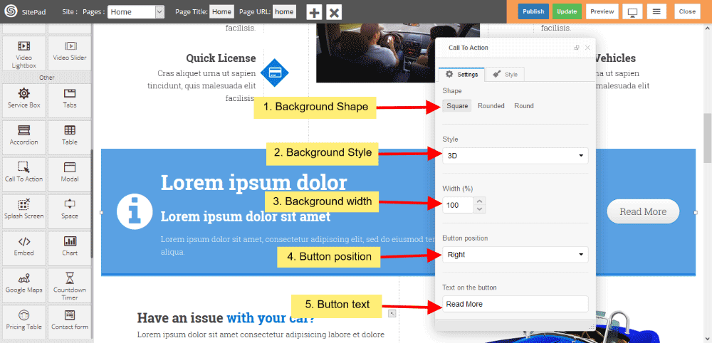
CALL TO ACTION BACKGROUND
- You can change Background shape, Background predefined style or custom style.
- You can change total width of background also.
- You also changed button position in background shape and text of the button.
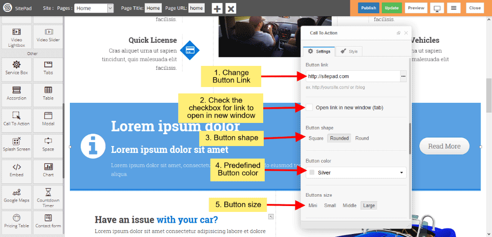
CALL TO ACTION BUTTON
- You can also give button link, and if you want that link open in new window, then click on checkbox.
- Button shape gives shape of button and choose predefined button color from dropdown list.
- Button size gives predefined Button size.
CALL TO ACTION BUTTON ICON
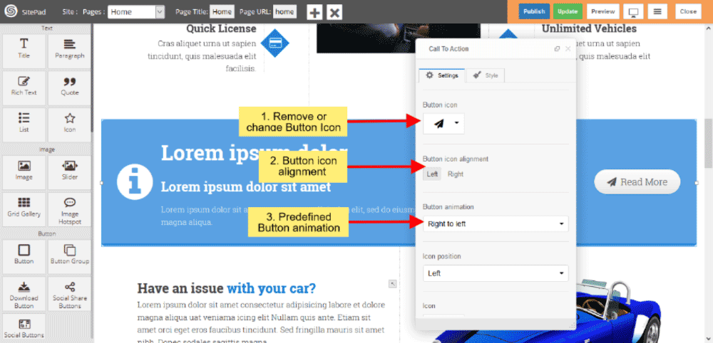
CALL TO ACTION ICON
- You can also change Icon position from dropdown list.
- Change Icon as per your choise from dropdown list.
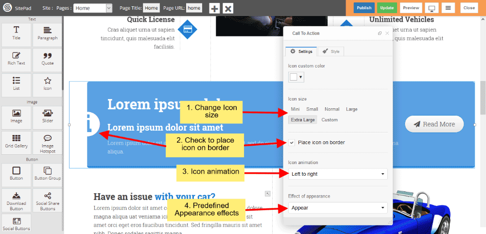
- Change predefined Icon color and custom color, If you choose custom color then you can change custom color.
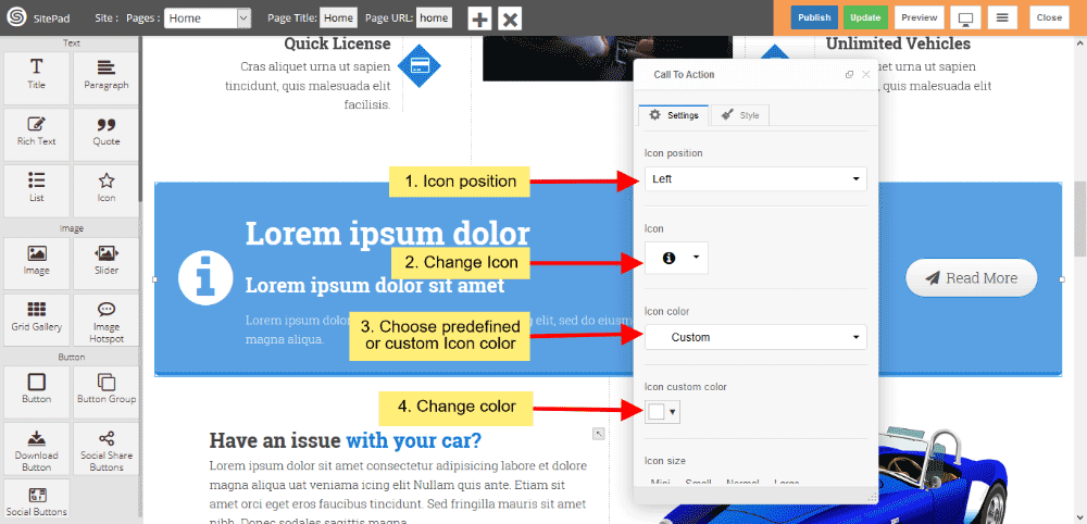
- Icon size gives you to change predefined size or custom size.
- If you want’s to place half Icon on border then click on checkbox.
- Icon animation provides to change animation style when page loads.
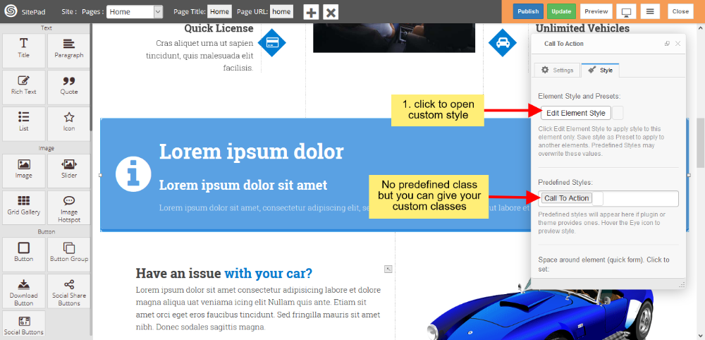
CALL TO ACTION STYLE
Style gives 2 types of style 1) Edit Element style and 2) Predefined style
- Edit Element style gives custom style in that you can change custom background color, text color, margin, border-radius etc.
- There is no predefined style but you can give your classes to define your custom style.
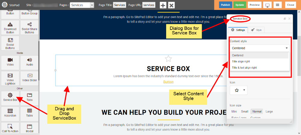
Service Box
This Guide will help you to add Service Box.
DRAG AND DROP SERVICE BOX
- Drag and Drop Service Box from left side widget panel as shown in image below.
- Now in Dialog Box of Service Box you can Customize Service Box.
- Select Content Style of your Service Box as shown in image below.
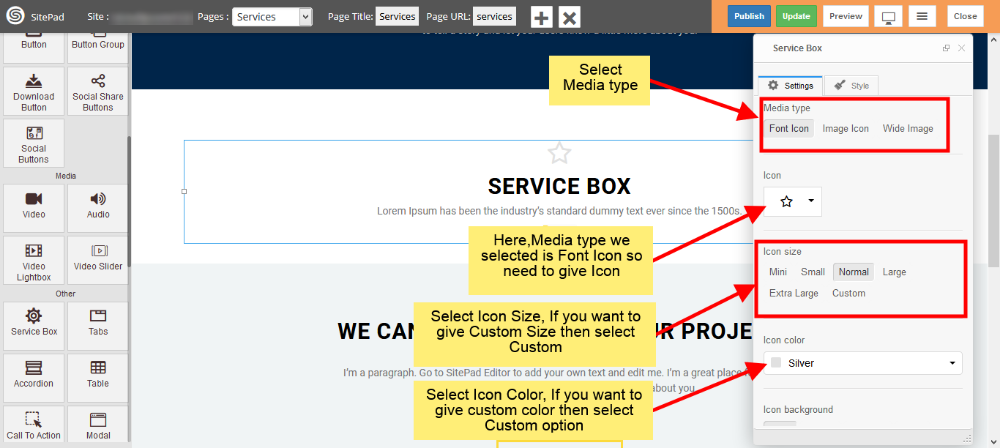
SERVICE BOX MEDIA TYPE
- Select Media type you want to display in your Service Box. We have selected Font Icon.
- As we selected Font Icon we need to Provide Icon as shown in image below. You need to provide image if you select Image Icon or Wide Image.
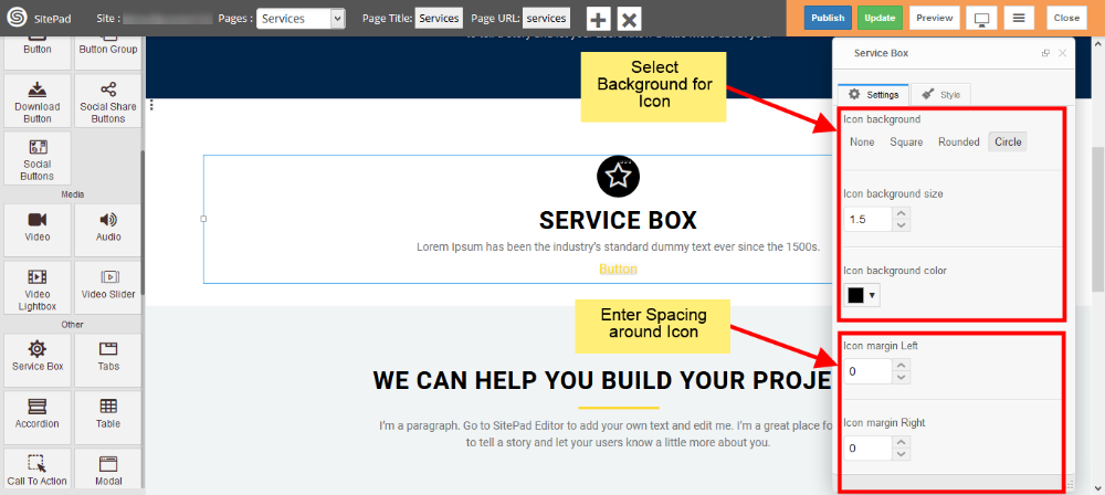
- Also provide some different properties for your media type like Color, Size etc as shown in image.
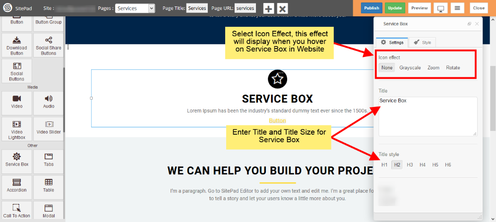
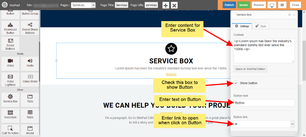
SERVICE BOX CONTENT
- Enter Service Box Title and give Size for Title as shown in image below.
- Enter content of your Service Box in Content section.
BUTTON
- Check the Show Button box to show Button in your Service Box as shown in image below.
- Next enter text to Display on Button and Link if you want go to other page on Button Click.
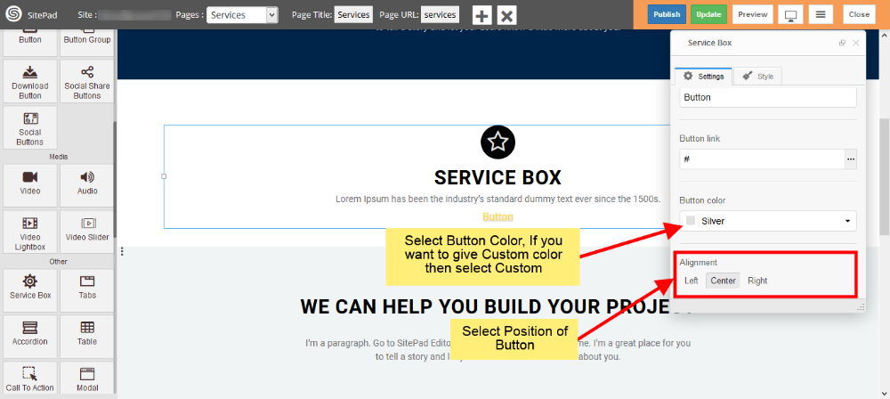
- Select Button color from Predefined options or you can give Custom color by selecting Custom as shown in image below.
- Select position for Button inside Service Box from Alignment section.
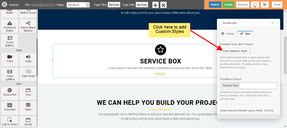
CUSTOM STYLE
- Click on Edit Element Style to add Custom styles as shown in image below.
Modal
This Guide will help you to add Modal.
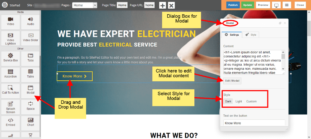
DRAG AND DROP MODAL
- Drag and Drop Modal from left side Widget Panel as shown in image below.
- Now in Dialog box of Modal you can change Modal content and Customize Modal.
CUSTOMIZE MODAL
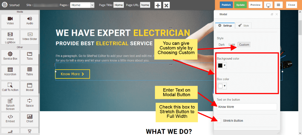
- To give ‘Custom styling to Modal just select Custom from Style as shown in image below.
- Once you select the Custom you will able to edit Background color and Box color as shown in image below.
- Now enter Text on Button to see it on your Modal Button.
- If you want Button to have Full Width then just check the Stretch box shown in image below.
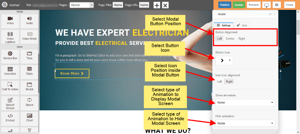
- Now select Position for Modal Button. There are 3 options Left, Center, Right just select one of them.
- Select Icon to display in Modal Button or if you don’t want icon then you can give it as Blank.
- If you select Icon then you need to give Position for Icon. By default it is Left but you can change it to Right also.
- Now select type of Animation to Arrive the modal screen on website and same for Hide also as shown in image below.
CUSTOM STYLES
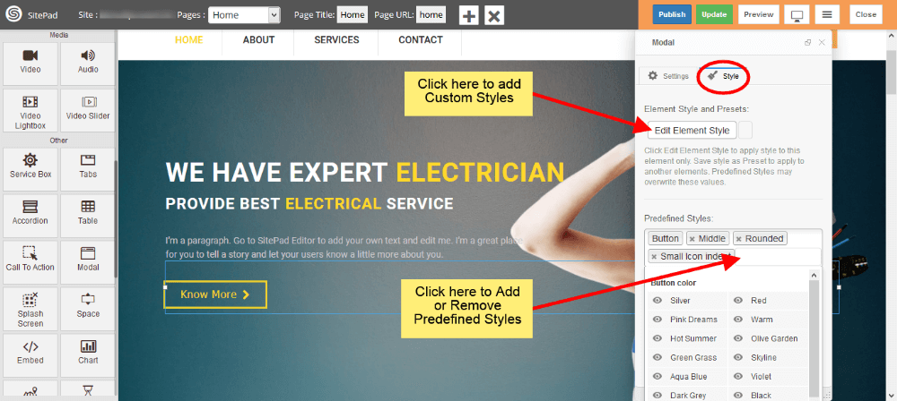
- You can select Predefined style by clicking on Predefined Styles as shown in image below.
- You can also give custom styles by clicking on Edit Element Style as shown in image below.
MODEL SCREEN VIEW
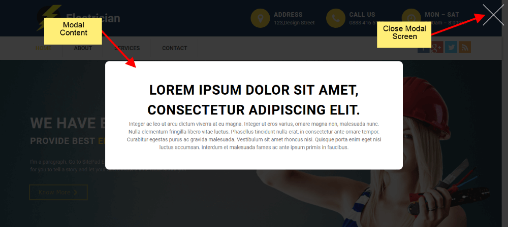
- When you Click on Model Button it will Display screen like in image below.
Embed
This Guide will Help you to edit Embed Widget Settings and Style.
Note: Widget gives you Default Style provided by theme, you can customize as per your needs using this guide.
DRAG & DROP EMBED WIDGET
When you Drag and Drop Embed Widget in a Page, You will see the image like below.
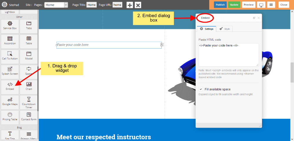
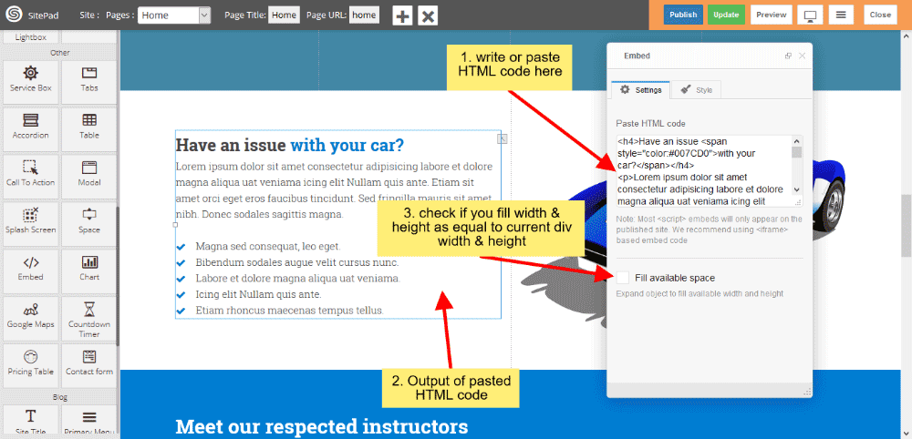
EMBED SETTINGS
- Write or paste HTML code in textarea box and you can give style also.
- Check the checkbox if you want’s full-width and height available in current div of a page.
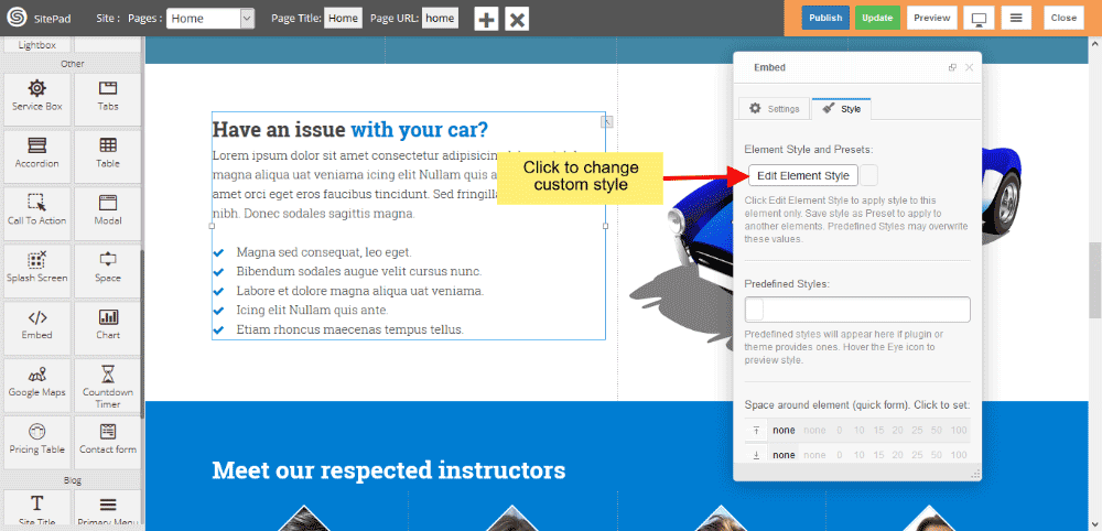
EMBED STYLE
- Edit Element style gives custom style in that you can change custom background color, text color, margin, border-radius etc.
- There is No Predefined style.
- You can also give your classes to define your custom style.
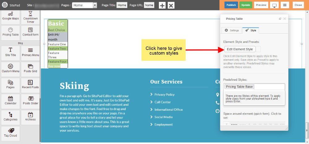
Pricing table
When the first Theme is selected it automatically gives the Predefined Style for Pricing Table but if you want to Customize Menu you can follow this guide.
- Drag and Drop Pricing Table from left side widget section. So this action will pop up Dialog Box for Pricing Table as shown in image below.
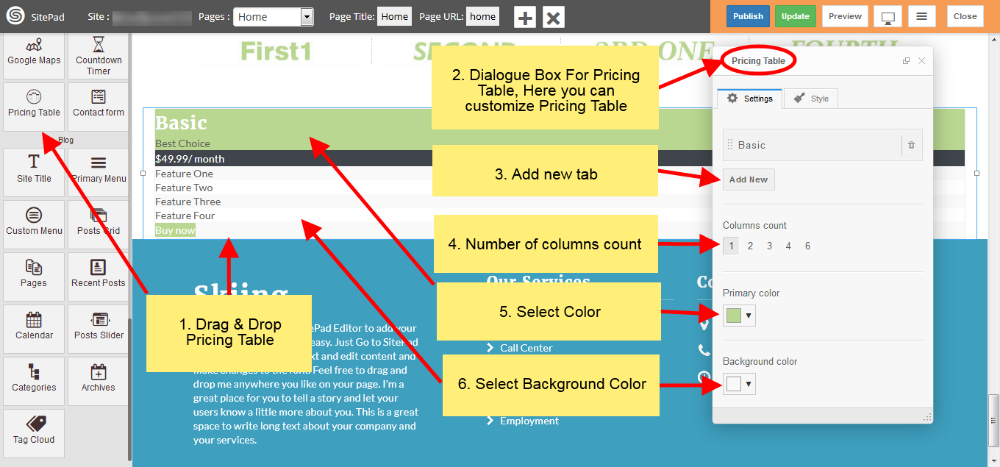
- Select Colors for Pricing Table pricing rows and border and select animation effect as per your needs as shown in images below.
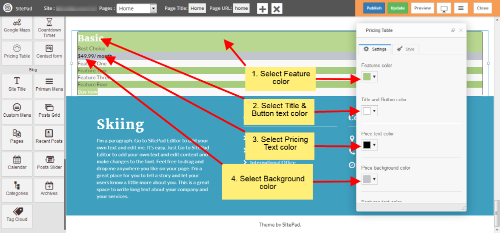
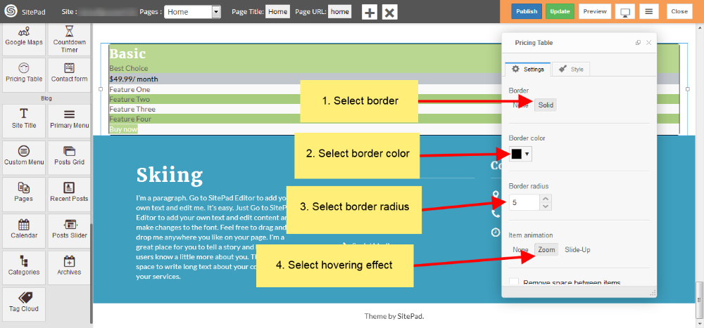
- Now in Settings section of Dialog Box you have different option to Customize Pricing Table and edit text accordingly of particular row as shown in images below.
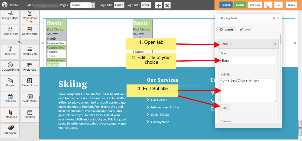
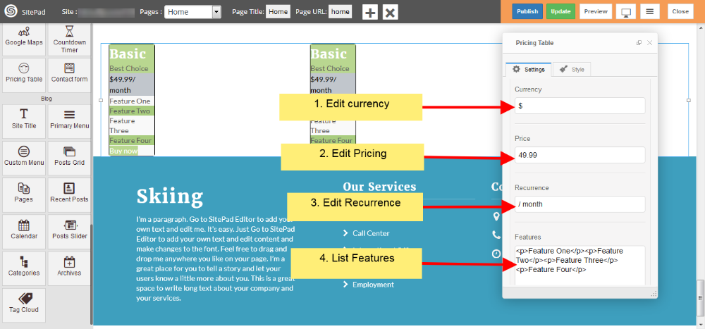
- Now in Styles section of Dialog Box you can edit element style as shown in image below.
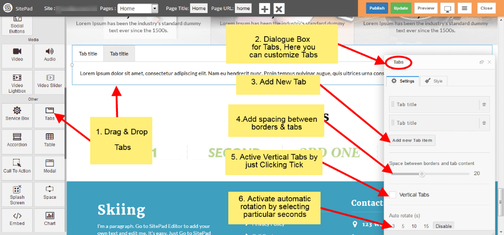
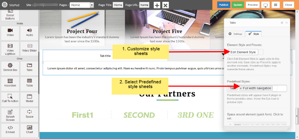
Tabs
When the first Theme is selected it automatically gives the Predefined Style for Tabs but if you want to Customize Tabs you can follow this guide.
- Drag and Drop Tabs from left side widget section then a Dialogue Box will pop up by this action for Tabs as shown in image below .
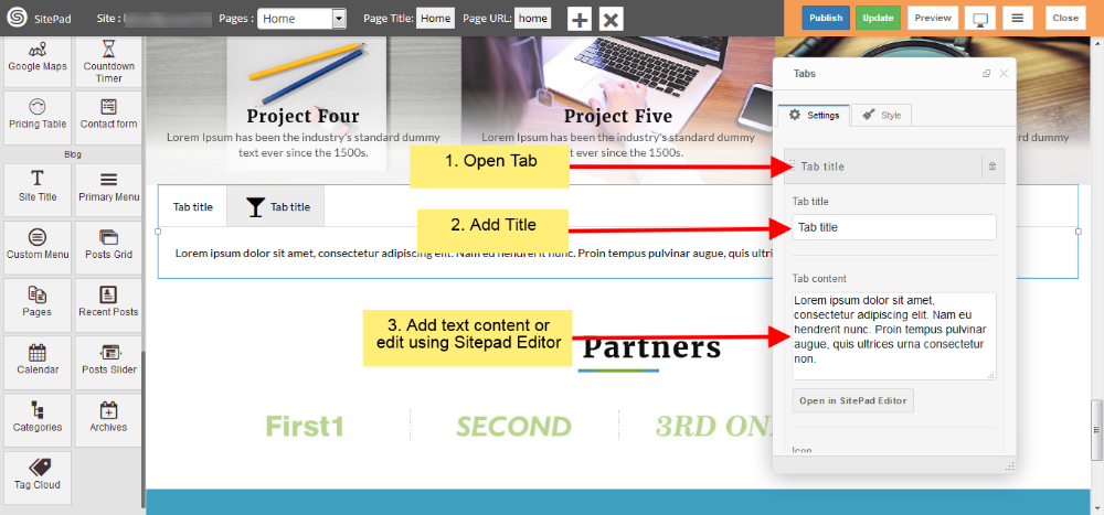
- Now in Settings section of Dialog Box you can open Tab and add text of your own as shown in image below.
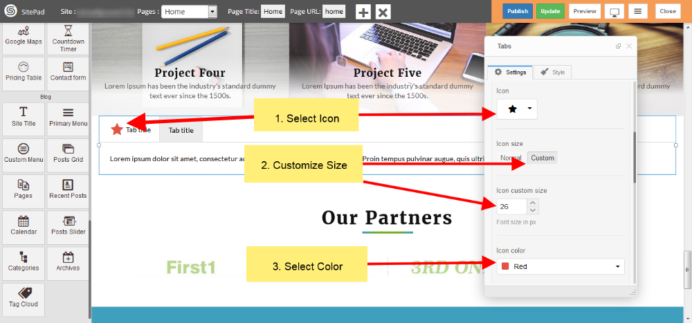
- In Settings section of Dialogue Box you can also select icons and customize as shown in figure below.
- Now in Style section of Dialog Box you can give Custom Style and also use Predefined Styles as shown in image below.
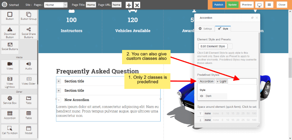
Accordion
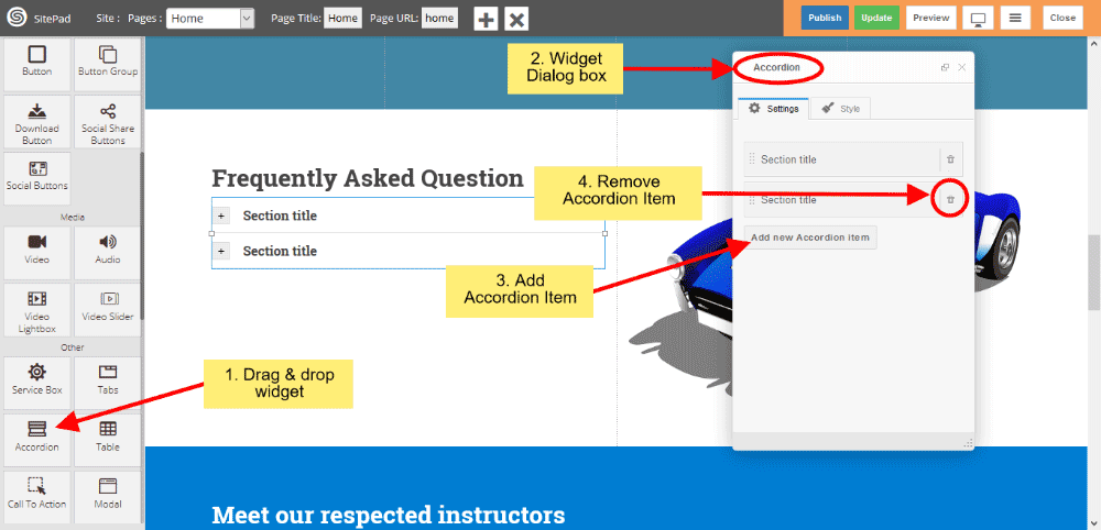
This Guide will Help you to edit Accordion Widget Settings and Style.
Note: Widget gives you Default Style provided by theme, you can customize as per your needs using this guide.
DRAG & DROP ACCORDION WIDGET
When you Drag and Drop Accordion Widget in a Page, You will see the image like below.
- Click on Add new Accordion item button to add new Accordion Item.
- If you want to Remove Accordion item then click on delete icon present on Accordion Item section.
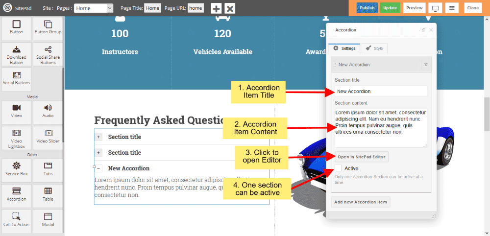
ACCORDION ITEM SETTINGS
- Section Title in that you can insert your Accordion Item title.
- Section Content gives you to insert your Item content.
- Or you can click on Open in SitePad Editor button to insert item content.
- Click on Active checkbox to active that particular item.
Note: Only one item can be active.
ACCORDION STYLE
Style gives 2 types of style 1) Edit Element style and 2) Predefined style
- Edit Element style gives custom style in that you can change custom background color, text color, margin, border-radius etc.
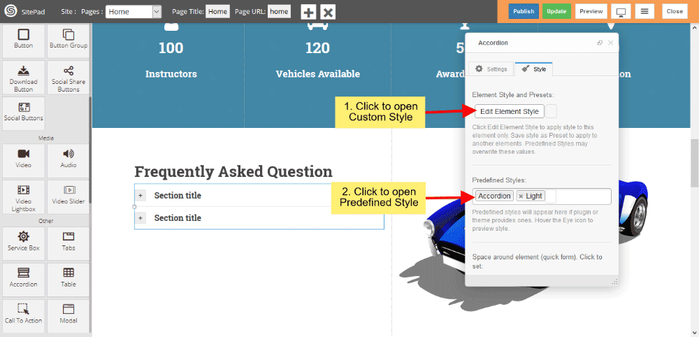
- Predefined style gives you classes of Accordion such as Light and Dark.
- You can also give your classes to define your style.
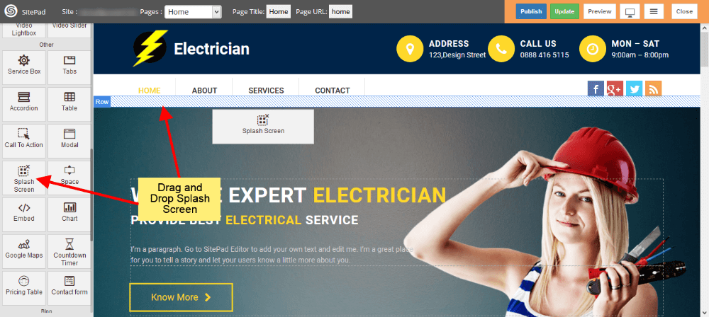
Splash Screen
This Guide will help you to add Splash Screen.
DRAG AND DROP SPLASH SCREEN
- Drag and Drop Splash Screen from left side Widget Panel at your desired portion of page.
- When your website window reach that portion, At that time Splash Screen will get Displayed.
- Here we have Dragged it at the Start of Page, so it will get Displayed when we load Page in Website.
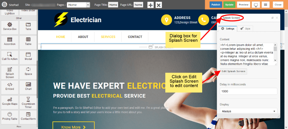
EDIT CONTENT
- When you Drag and Drop Splash Screen it will open Dialog Box for it.
- Now in Dialog Box you can edit content by clicking on Edit Splash Screen as shown in image below.
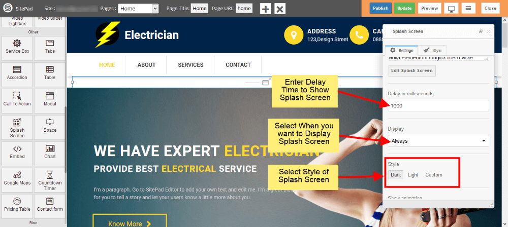
DELAY TIME AND DISPLAY
- Delay time will delay the Arrival of Splash Screen with that much time.
- Select when you want to display Splash Screen from Display options.
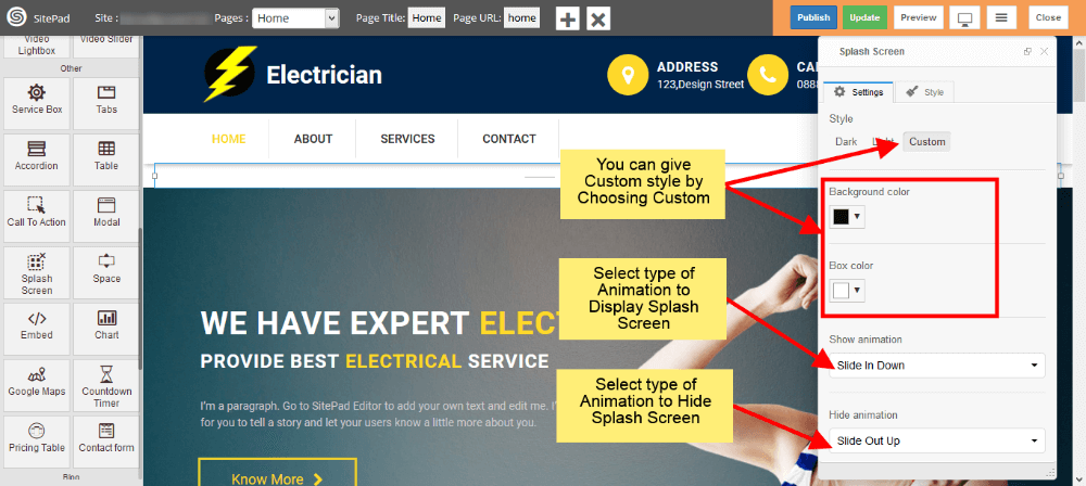
- Select style of Splash Screen. If you want to give your custom style then select Custom.
STYLE AND ANIMATION
- You can add your custom style by selecting Custom as shown image below.
- There is another way to give custom styles which is given in later steps.
- Now select type of Animation to Arrive the Splash Screen on your page. Same to Hide the Splash Screen.
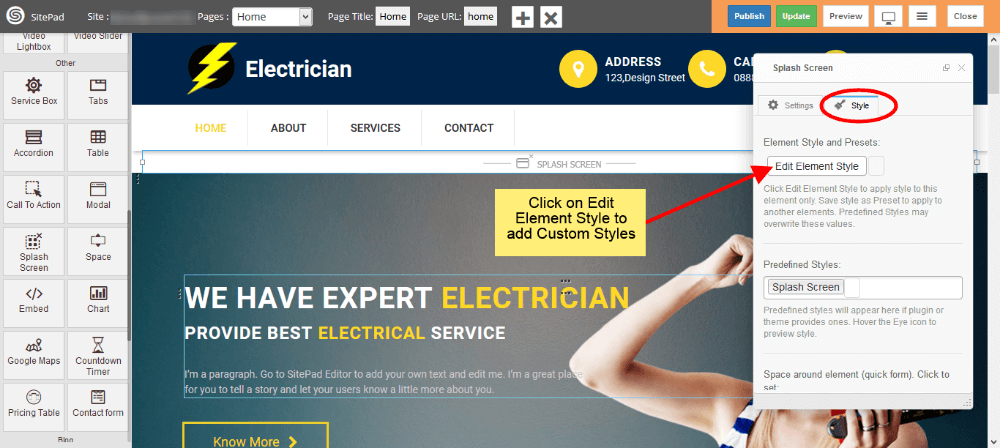
CUSTOM STYLES
- This is the second way to give custom style to Splash Screen.
- Just click on Edit Element Style to add custom styles.
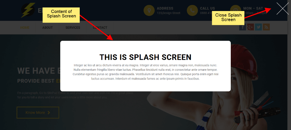
SPLASH SCREEN VIEW
- Splash Screen will look like as shown in image below in your website.
Download Button
This Guide will Help you to edit Button Widget Settings and Style.
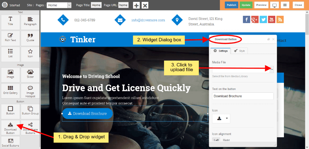
DRAGDROP DOWNLOAD BUTTON WIDGET
When you Drag and Drop Download Button Widget in a Page, You will see the image like below.
Note: Widget gives you Default Style provided by theme, you can customize as per your needs using this guide.
DOWNLOAD BUTTON SETTINGS
- Media File If you want to upload Files for downloading then you have to upload files by clicking on 3 horizontal dots and Insert Button text in button textbox.
- If you want to remove or change font Icon then click on Icon List and choose Icon from them.
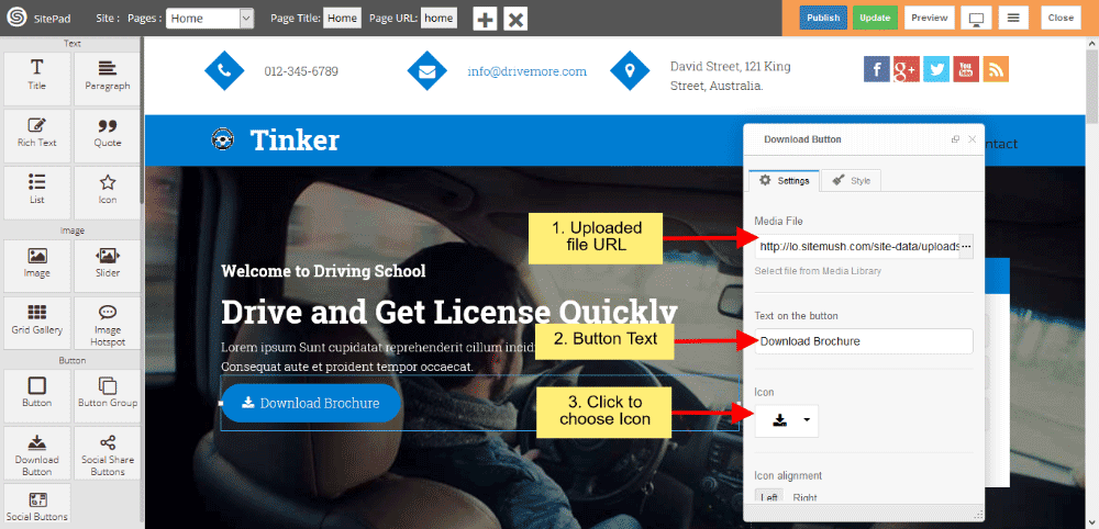
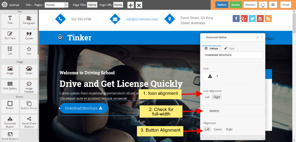
- Icon alignment gives you alignment of Icon such as Left or Right.
- If you want the Button in full width style then check the checkbox of Stretch, and Alignment Settings gives you Button Alignment.
DOWNLOAD BUTTON STYLE
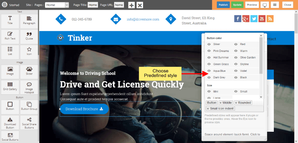
Style gives 2 types of style 1) Edit Element style and 2) Predefined style
- Edit Element style gives custom style in that you can change custom background color, text color, margin, border-radius etc.
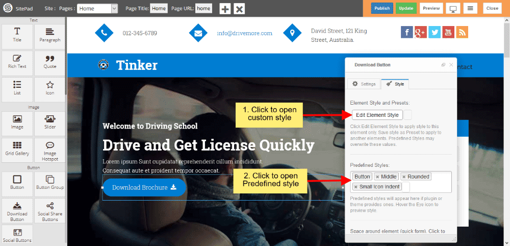
- Predefined style gives you classes of various predefined button for Background and Text color. And Size gives you various types of Button Size.
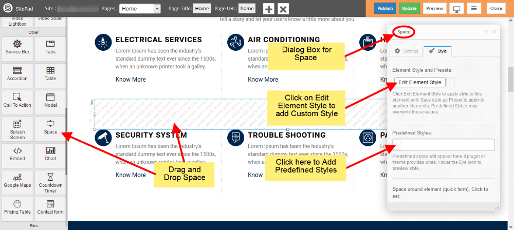
Space
This Guide will help you to add Space Widget.
DRAG AND DROP SPACE WIDGET
- Drag and Drop Space Widget from left side Widget Panel as shown in image below.
- Now in Dialog box of Space widget you can select Predefined Styles and you can also add custom styles by clicking on Edit Element Style as shown in image below.
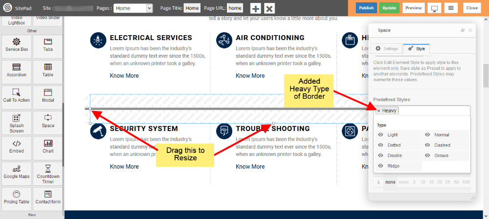
PREDEFINED STYLES
- You can add Border in middle of Space area as shown in image below, We have selected Heavy.
- Select type of border you want from different options.
- You can resize the Height and Width of Space by Dragging as shown in image.
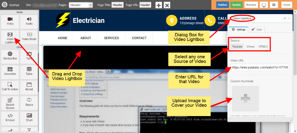
Video Lightbox
This Guide will help you to add Video Lightbox.
YOUTUBE SOURCE
- Drag and Drop Video Lightbox from left side Widget Panel.
- Now in Dialog box of Video Lightbox select Youtube from source section as shown in image below.
- After that enter Youtube Video URL.
- Select Cover Image if you need any.
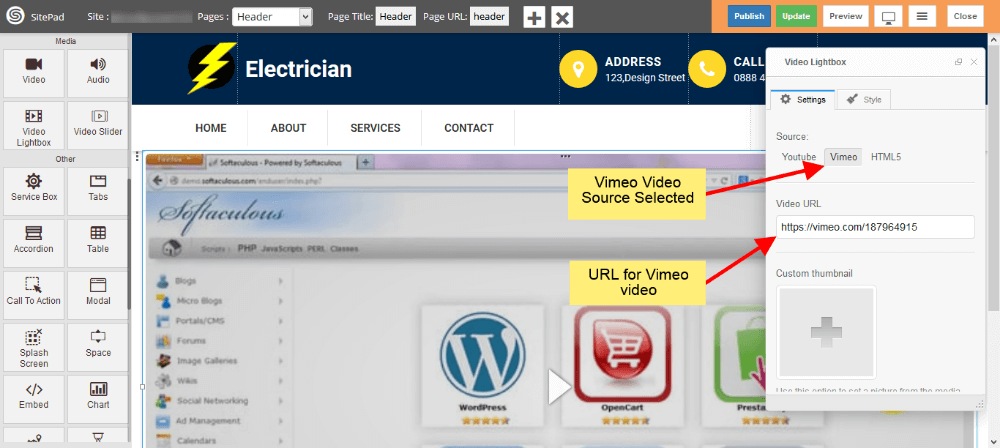
VIMEO SOURCE
- Select Vimeo from source section as shown in image below.
- After that enter Vimeo Video URL.
- Select Cover Image if you need any.
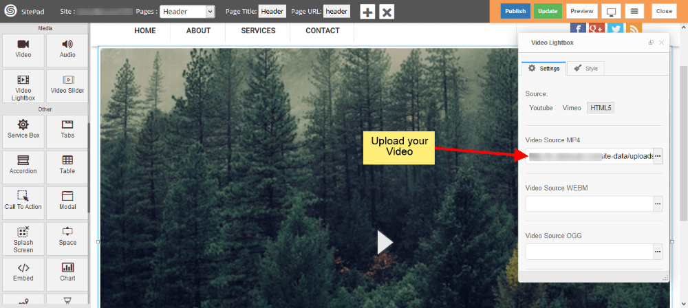
HTML5 SOURCE
- Select HTML5 from source section as shown in image below.
- After that upload Video in any one format by clicking on Three Vertical dots as shown in image below.
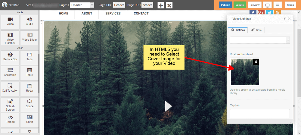
Note: In HTML5 Source you need to select Cover image for your video as shown in image below.
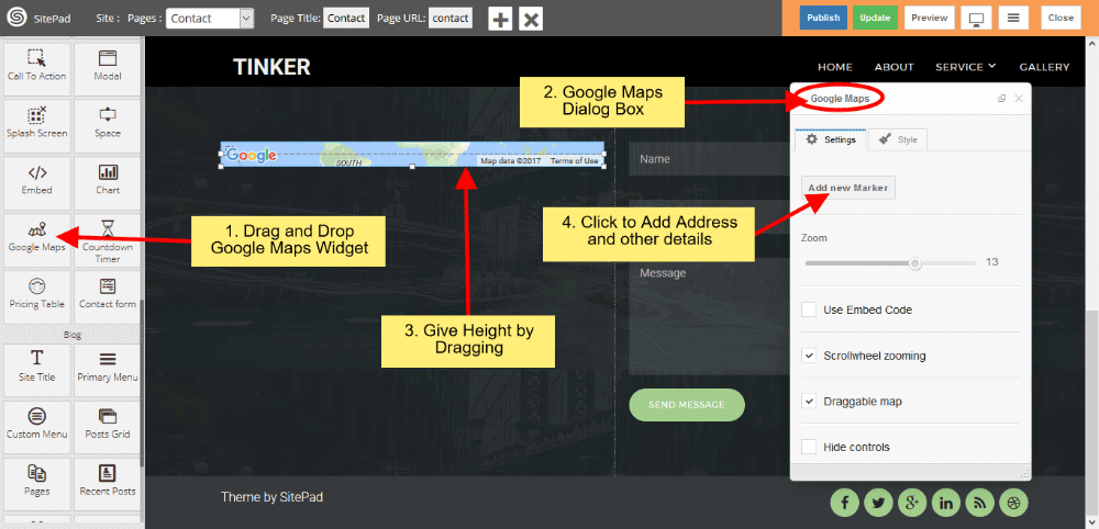
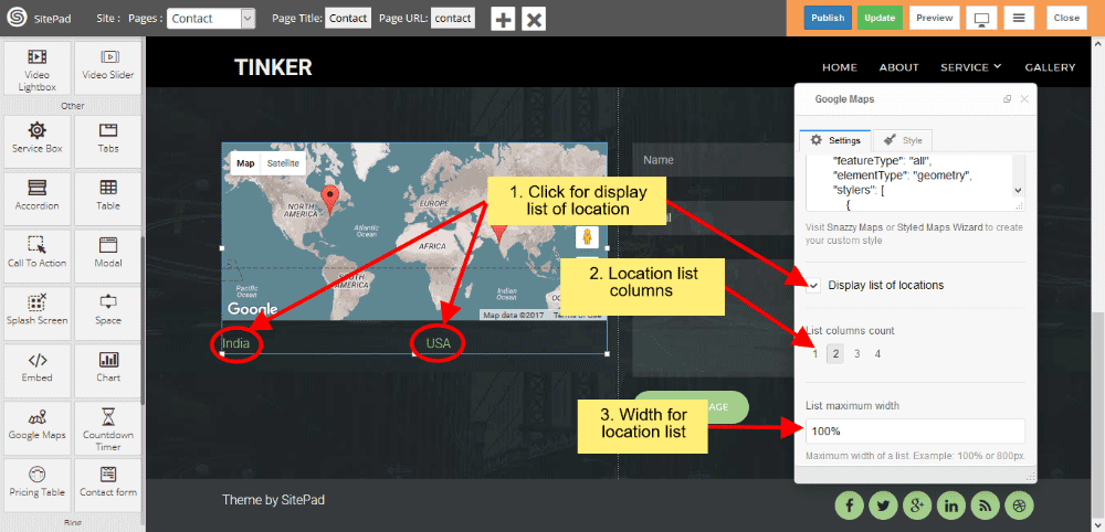
Google Maps
This Guide will Help you to customize Google Map Widget Settings and Style.
DRAG GOOGLE MAP WIDGET
When you Drag and Drop Google Map Widget in a Page. You will see the image like below.
Note: Widget gives you Default Style provided by theme, you can customize as per your needs using this guide.
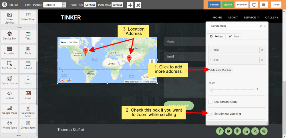
COMPANY DETAILS
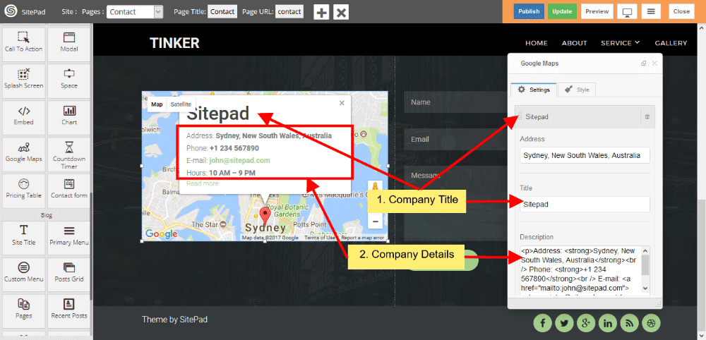
- When you click Add new Marker, you can able to customize Company Details such as Title, Address and other information.
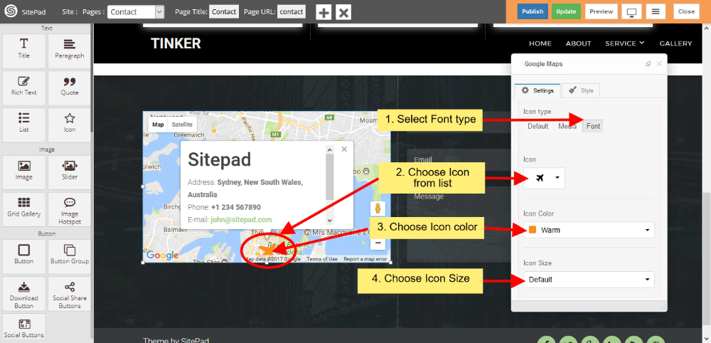
- You can add Link Text to company details for other information and that text give Link also. If you want to change Icon then select Icon type, ‘Default is enabled when you drag and drop the widget.
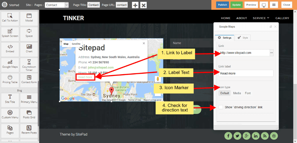
- When Darg and Drop the widget Default is enabled, If you want to give Image instead of Icon for marker, then select image. And select Icon Type for giving the styling of Icon. Choose Icon from the list, choose Icon color and give font size for selecting the Icon size.
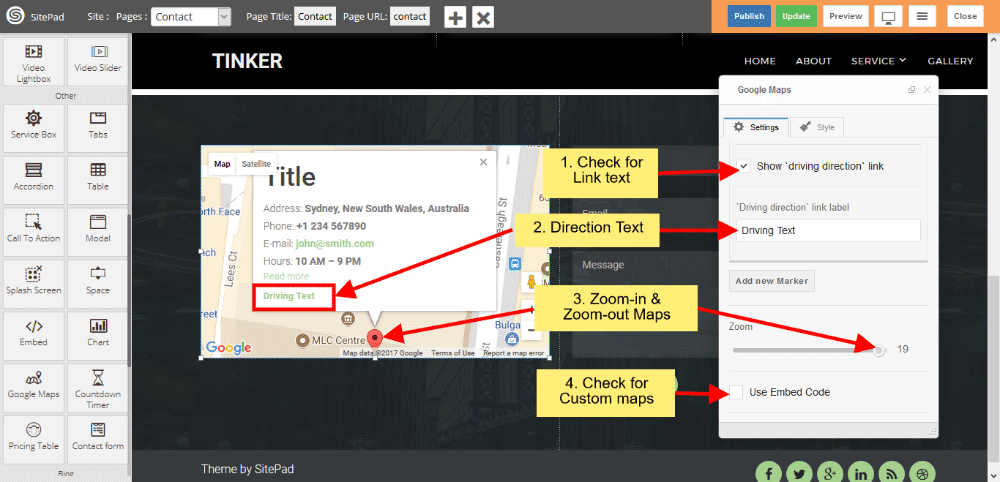
- Click checkbox for giving the Driving Direction Text and Link. You can zoom-in and zoom-out map with the help of Zoom control. Click on checkbox to give Embed Code for Google Map.
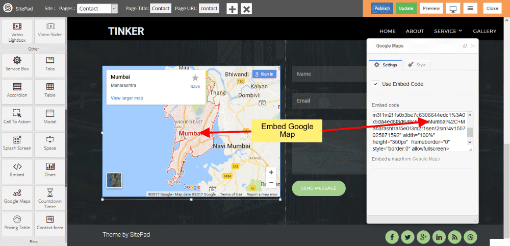
EMBED GOOGLE MAP
Click on checkbox to use Google Embed code from Google Map, paste that Iframe code in Embed code area.
MULTIPLE LOCATION
Click on Add new Marker to give address details and other information, For giving multiple location click on Add new Marker. Scroll Zooming check this checkbox for zooming while scrolling.
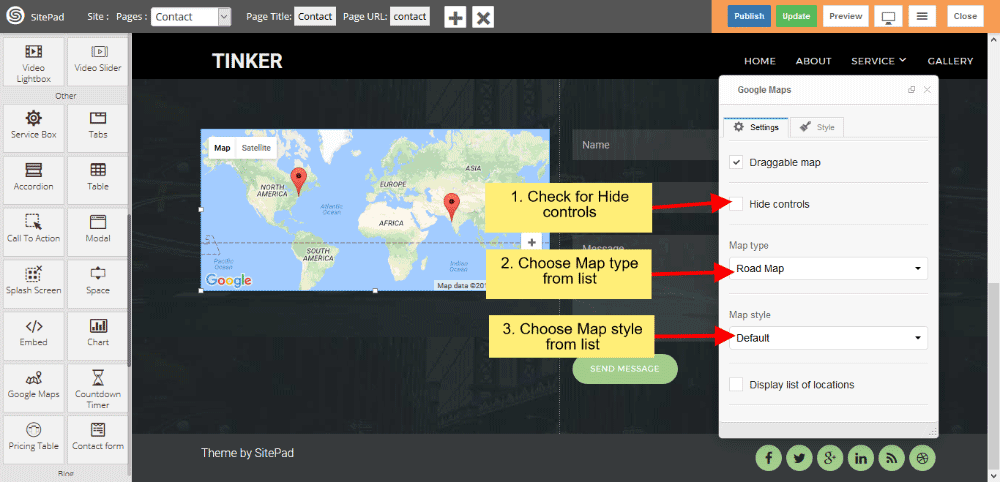
MAP TYPE AND MAP STYLE
Select predefined Map type from dropdown list, and select predefined Map style from dropdown list.
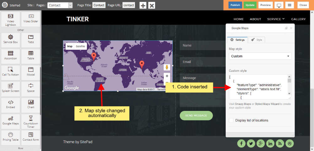
MAP CUSTOM STYLES
- Select Custom in Map style to give custom style for Map. Click on Snazzy Maps to give custom style for Google Map.
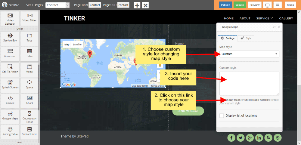
- Paste custom code in Custom Style textarea.
LOCATION LIST
Click on checkbox for displaying Location List. List column count gives column count for displaying location list in selected particular column. List maximum width gives total width for displaying Location list.
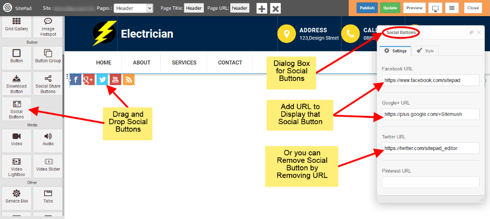
Social buttons
This Guide will help you to Customize Social Buttons.
- Drag and Drop Social Buttons from left side Widget panel. Now in the Settings section of Social Buttons Dialog box enter URL for Social Buttons to display them or remove URL to remove button as shown in image below.
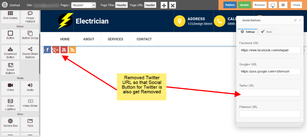
- Here we removed Twitter URL so that Social Button for Twitter is also get removed.
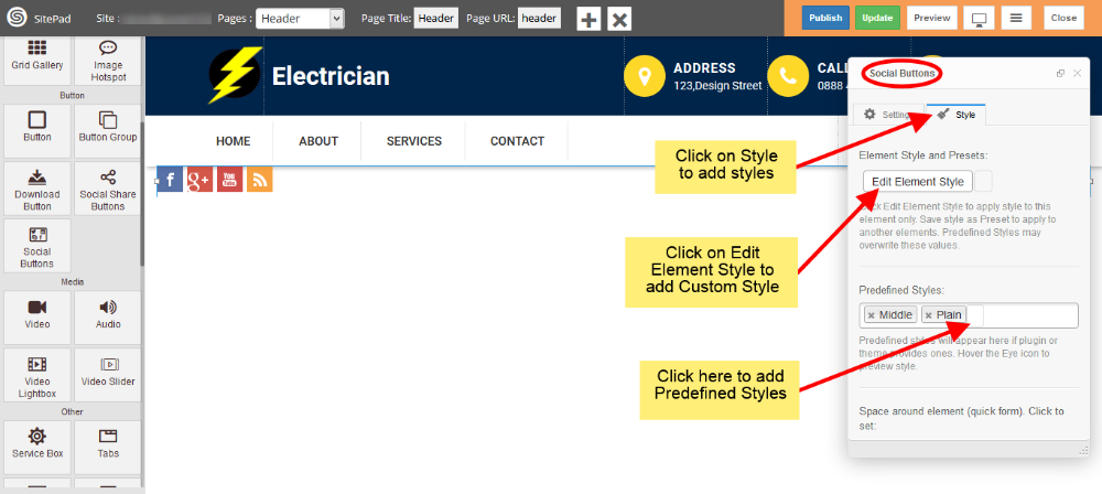
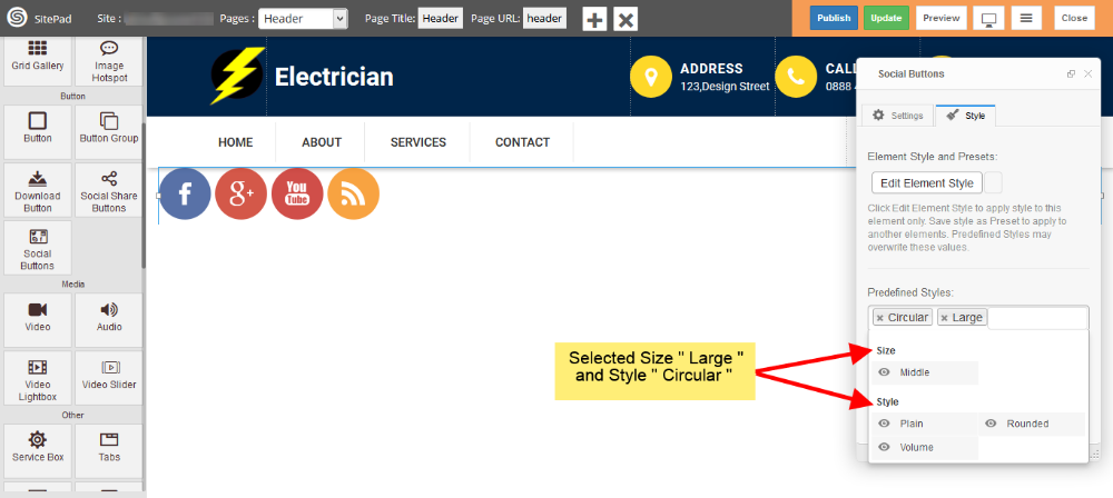
- Now click on Style to add styling for Social Buttons. Click on Edit Element Style to add Custom Style and click in Predefined Styles to add Predefined styles as shown in image below.
Note: Please not that Background Color for Social Buttons is Predefined so you will not able to change that.
-
Now see in image below we have selected Size Large and Style is Circular so styling for Social Buttons have Changed.
Contact Form
This guide will help you to Customize Contact Form.
-
- Drag and Drop Contact Form from left side Widget Panel or simply click on it if already present in page to open Dialog Box. Now in Dialog Box Click on Add New Field to add new input field to your Form. Enter Button label and check use reCAPTCHA box if you want to use it as shown image below. If you don’t know how to setup reCAPTCHA then follow this guide. Setup reCAPTCHA for Contact Form
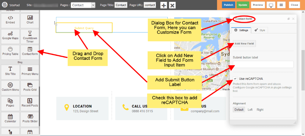
- Drag and Drop Contact Form from left side Widget Panel or simply click on it if already present in page to open Dialog Box. Now in Dialog Box Click on Add New Field to add new input field to your Form. Enter Button label and check use reCAPTCHA box if you want to use it as shown image below. If you don’t know how to setup reCAPTCHA then follow this guide. Setup reCAPTCHA for Contact Form
-
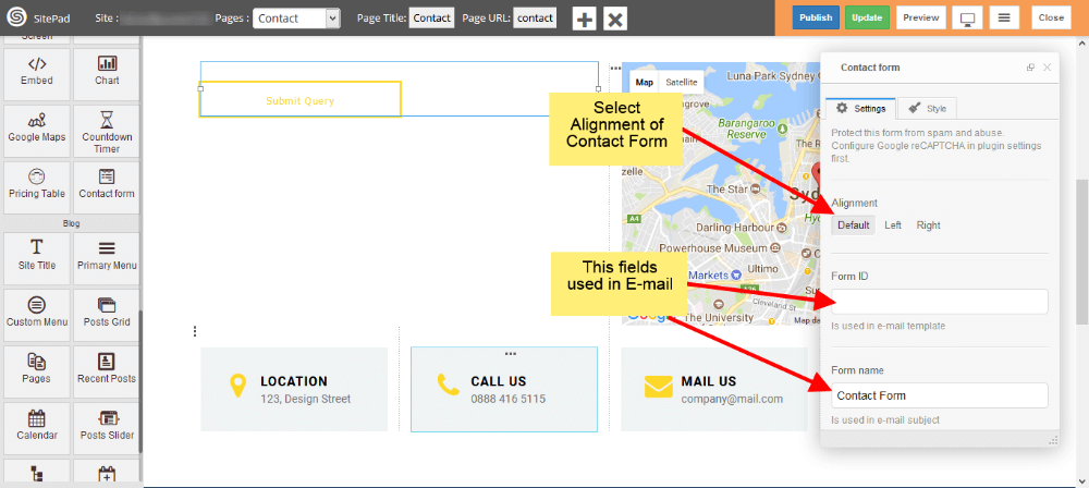
- Now select Alignment for your Contact Form as per requirements. Form ID and Form Name this fields is used in E-mail template.
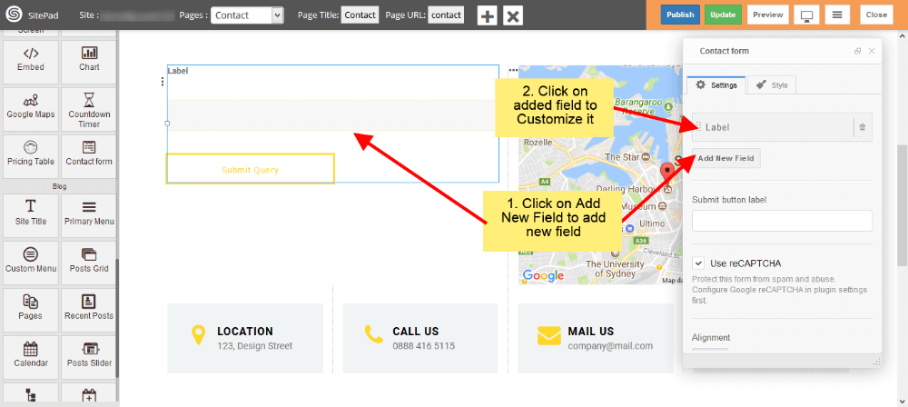
- To add new fields just click on Add New Field. To customize newly added field just click on that particular field as shown in image below.
- Now select Alignment for your Contact Form as per requirements. Form ID and Form Name this fields is used in E-mail template.
-
- Now add Label for input field and select Type of that field. We have different input types like Text for names or surnames, E-mail for e-mail, Text area for messages etc.
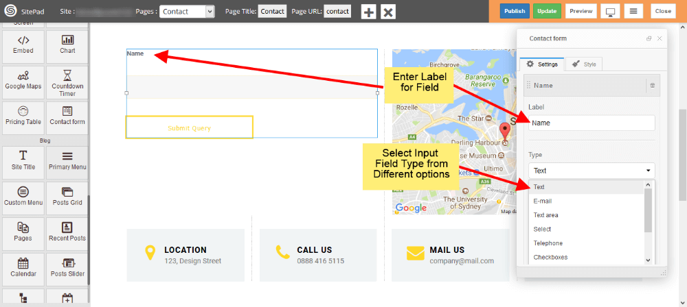
- Now add Label for input field and select Type of that field. We have different input types like Text for names or surnames, E-mail for e-mail, Text area for messages etc.
-
- To add the file upload option in contact form, Please select File form Type section dropdown as shown in figure.
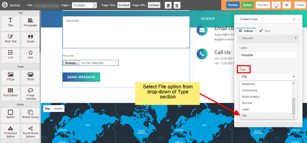
- To add the file upload option in contact form, Please select File form Type section dropdown as shown in figure.
-
- Check Use Label as Placeholder box to place your label as a Placeholder. If you want any field as a required field then check Required box. Enter CSS class and ID if you need them.
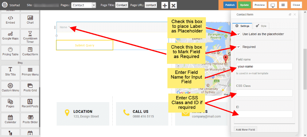
- Check Use Label as Placeholder box to place your label as a Placeholder. If you want any field as a required field then check Required box. Enter CSS class and ID if you need them.
-
- You can add multiple input fields into your Contact Form as shown image below.
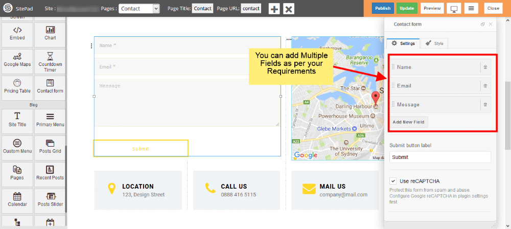
- You can add multiple input fields into your Contact Form as shown image below.
-
- You can set Reply To as shown in the image below.
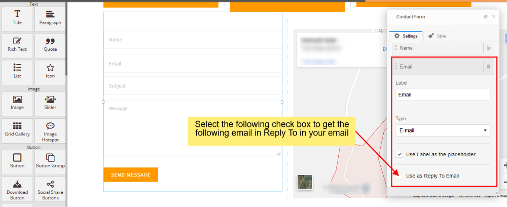
- You can set Reply To as shown in the image below.
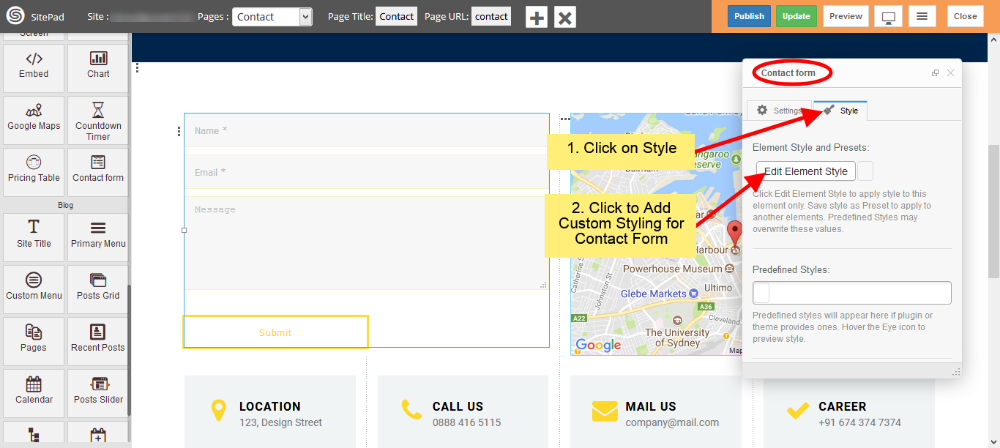
- You can add Custom Style for Contact Form by following below image steps.
Chart
This Guide will Help you to edit Chart Widget Settings and Style.
DRAG CHART WIDGET
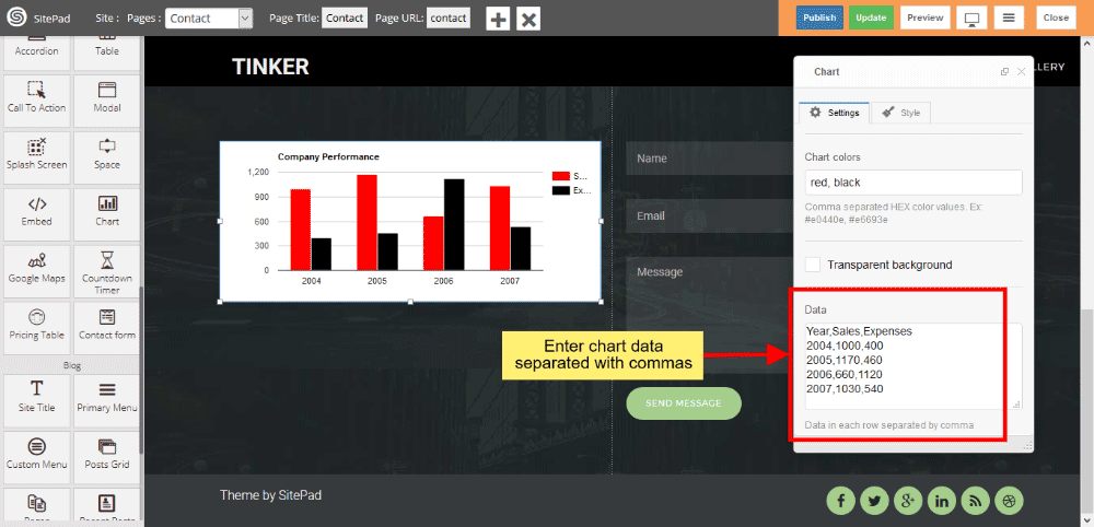
When you Drag and Drop Chart Widget in a Page. You will see the image like below.
Note: Widget gives you Default Style provided by theme, you can customize as per your needs using this guide.

CHART TITLE AND TYPE
You can enter Chart Title and select Chart Type according to your needs. Various predefined chart type is available such as Column chart, Bar chart, Area chart, Histogram, Line chart etc. Column chart is enabled when you drag and drop the widget.
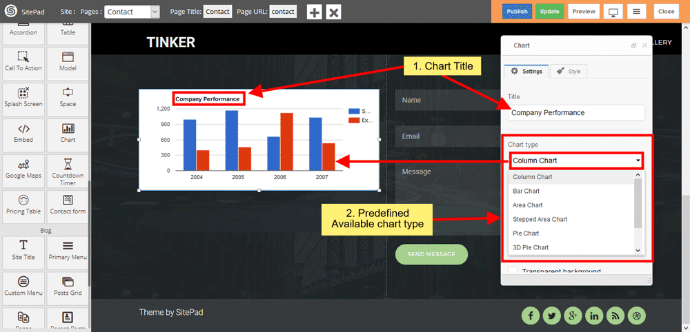
CHART COLOR
You can customize chart color according to your needs, click on checkbox to remove chart background.
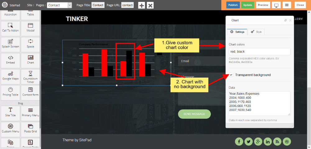
CHART DATA
Enter chart data in Data Textarea box, Insert column-wise data separated with commas.
List
This Guide will Help you to edit List Widget Settings and Style.
DRAG LIST WIDGET
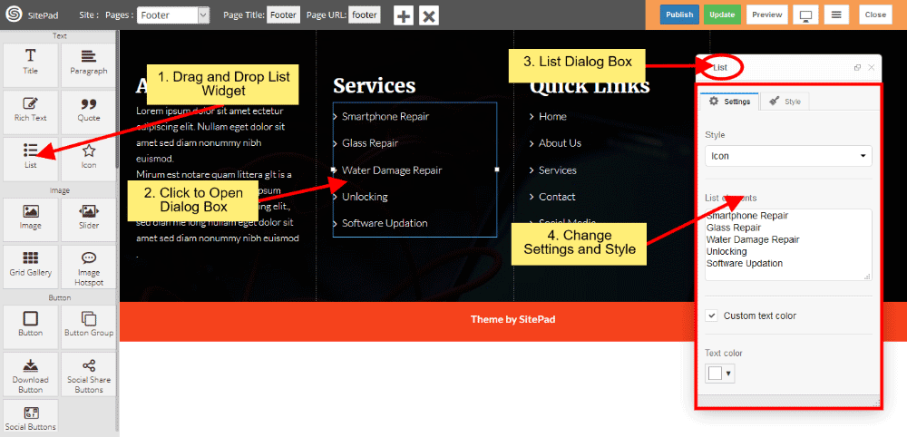
When you Drag and Drop List Widget in a Page. You will see the image like below.
PREDEFINED LIST STYLE
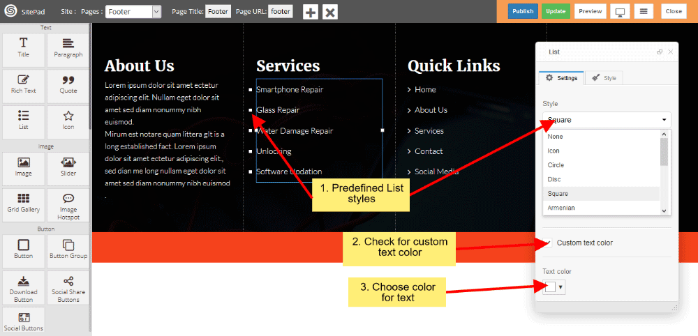
When you Open Dialog Box, you can be able to customize List Style according to your choice. There are various list style such as Icon, Circle, Disc, Square, Armenian, Georgian, None etc.
If you want to change text color then click on checkbox and change text color.
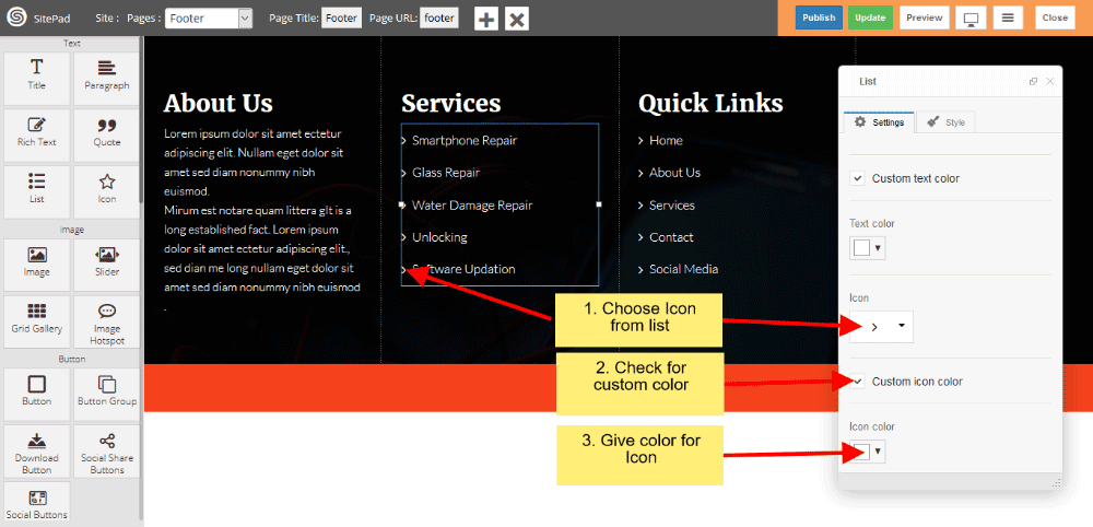
ICON STYLES
If you choose Icon from List style then you can change Icon from Icon List. And you can also customize icon text color, for that purpose you have to click on checkbox then change Icon color which suits for your needs.
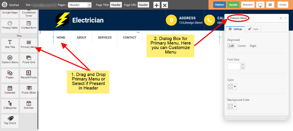
Primary Menu
When the first Theme is selected it automatically gives the Predefined Style for Menu but if you want to Customize Menu you can follow this guide.
- Drag and Drop Primary Menu from left side widget section or Select Primary Menu section in Header page if already present. So this action will pop up Dialog Box for Primary Menu as shown in image below.
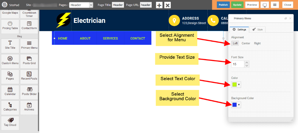
- Now in Settings section of Dialog Box you have different option to Customize menu like Text Color, Background Color, Text Size etc. Just fill that as per your needs as shown in image below.
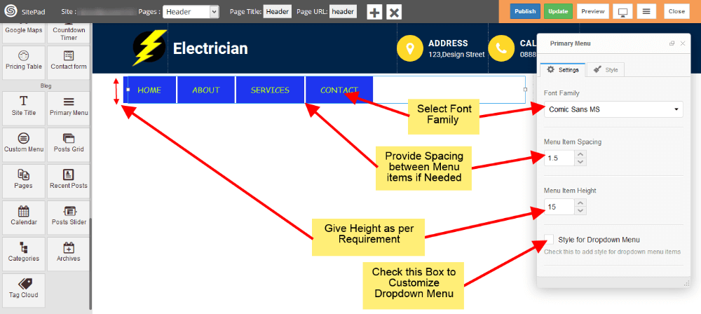
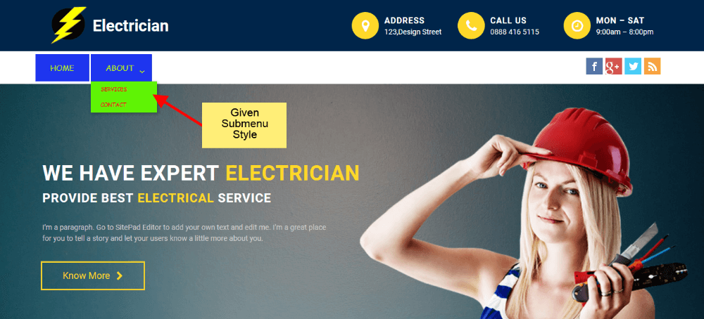
- Last option in below image is for styling the Sub Menu Items, if you want to do that just check it.
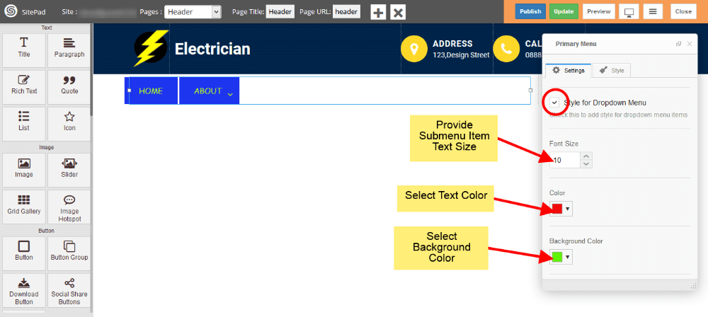
- Now select Color, Background Color, Text Size for Sub-Menu as shown in image below.
Above Sub-Menu style will look like this.
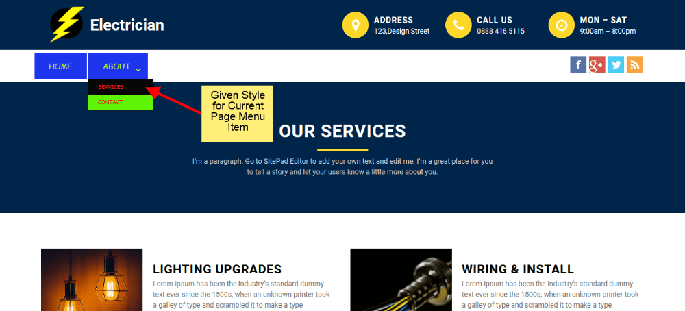
- If you want to add custom style for Active page Menu Item then just check the Active Page Effect box and provide Color, Background Color for Active Page Menu Item as shown in image below.
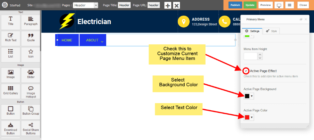
Above Active Page Menu Item style will look like this.
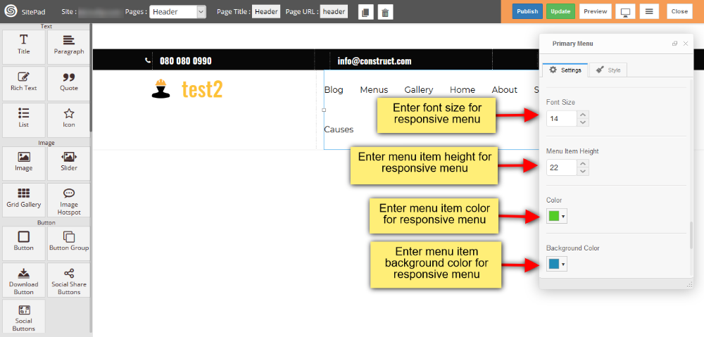
- If you want to add custom style for Toggle Button then just click on the checkbox of Responsive Menu Style and provide Bar Color, Bar Background Color for Toggle button as shown in image below.
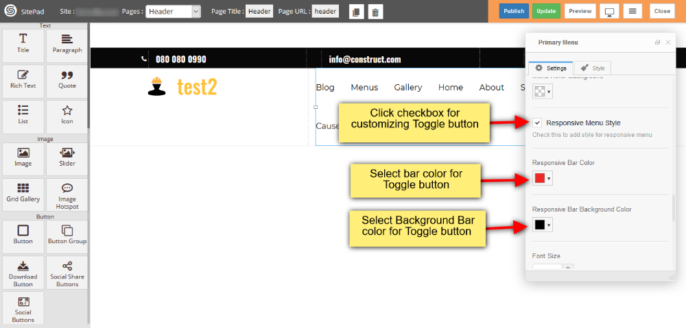
- And also you can add custom font size, Menu Item height, color and background color for menu item as shown in image below.
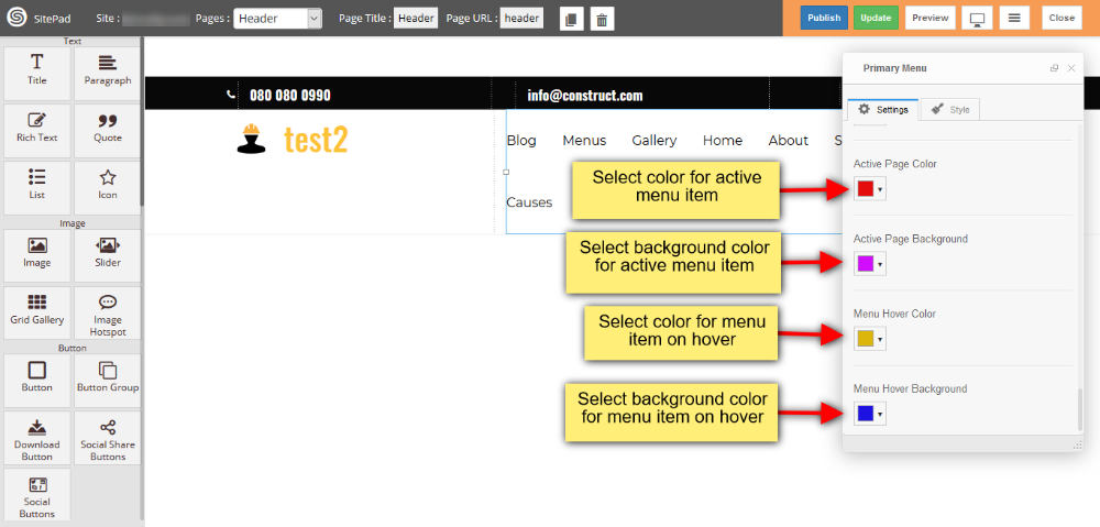
- You can also customize active menu item such as color and background color, and you can also select color and background color for menu item on mouse hover as shown in image below.
Audio
This Guide will help you to add Audio
AUDIO USING URL
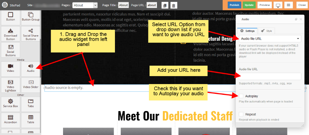
- Drag and Drop Audio from left side Widget Panel.
- Now in Dialog box of Audio select Audio file URL to give URL of audio file.
- After that enter Audio URL in Audio file URL section as shown in image below.
- Check the Autoplay box if you want to Autoplay your audio when page is loaded.
- Check the Repeat box if you want to Repeat your audio when it gets finished.
AUDIO USING MEDIA
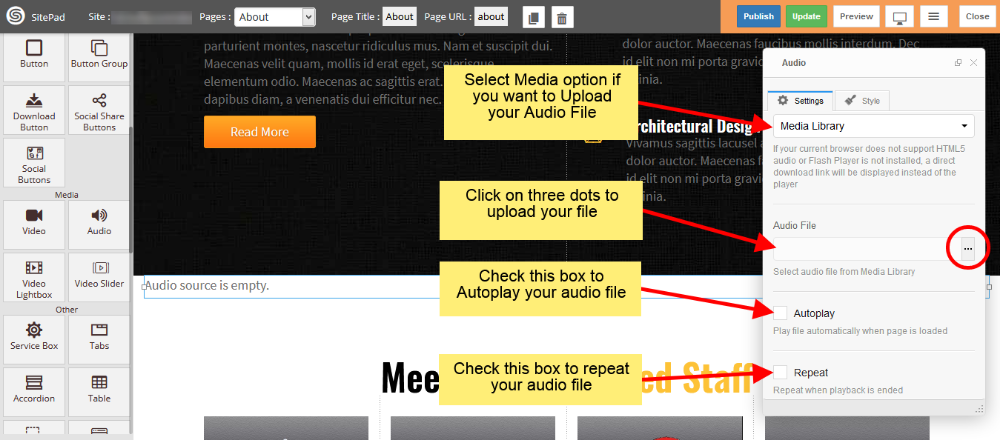
- Drag and Drop Audio from left side Widget Panel.
- Now in Dialog box of Audio select Media Library to Upload the audio file.
- After that click on three dots to upload your audio file as shown in image below.
- Check the Autoplay box if you want to Autoplay your audio when page is loaded.
- Check the Repeat box if you want to Repeat your audio when it gets finished.
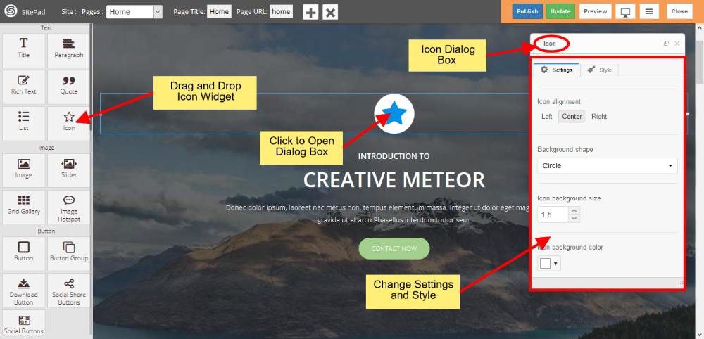
Icon
This Guide will Help you to edit Icon Widget Settings and Style.
DRAG ICON WIDGET
When you Drag and Drop Icon Widget in a Page. You will see the image like below.
Note: Widget gives you Default Style provided by theme, you can customize as per your needs using this guide.
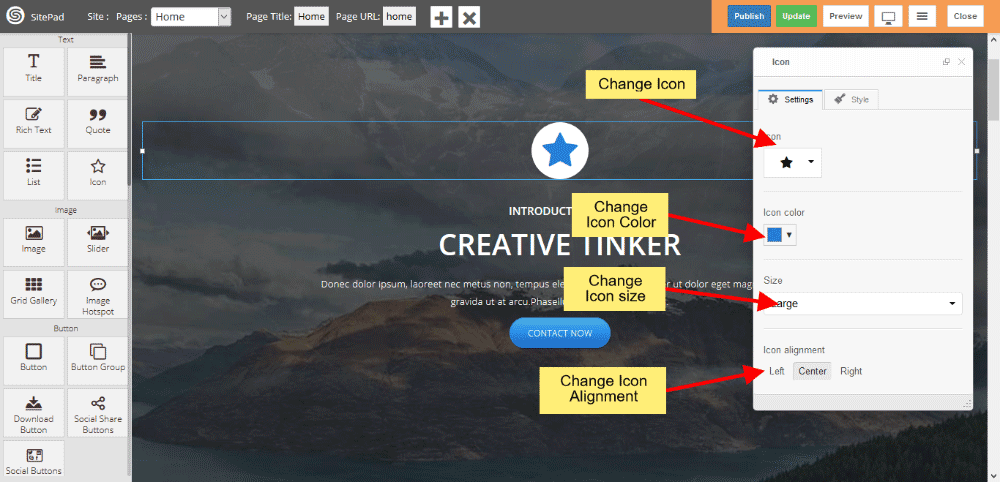
ICON WIDGET SETTINGS
When you Open Dialog Box, you can be able to customize Icon from the list and Icon Color also.
Icon Size gives you different predefined sizes of Icon, simply choose size from dropdown list and if you want to give custom size then choose custom link from dropdown list.
Icon Alignment gives you Alignment of Icon in a page.
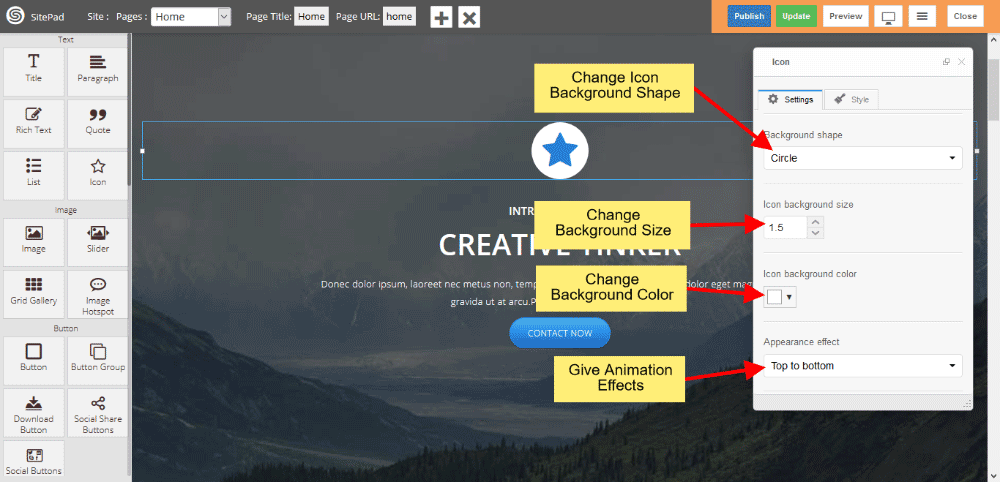
EDIT BACKGROUND STYLES
You can edit Background Shape like Circle, Square, Rounded, Outline Circle, Outline Square, Outline Rounded and None.
Icon Background Size gives you space around the Icon, and background color gives you the Background Color.
Appearance Effect gives Animation like Top to bottom, Bottom to top, Left to right, Right to left, Appear and None also.
ICON CUSTOM LINK
Custom Link gives Link to Icon.